Designing Product Success Across Industries
At ProCreator, we unleash creativity and innovation to redefine user experiences across diverse indutries.
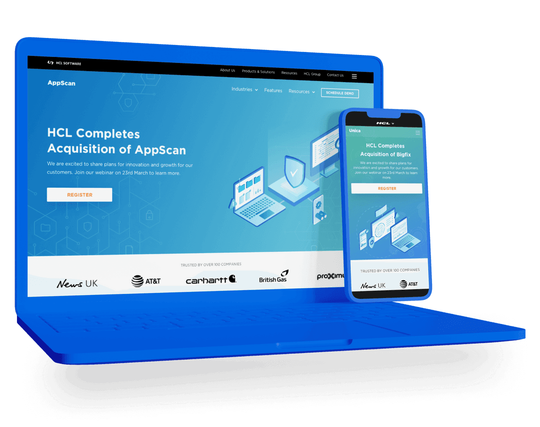
HCL
Built Design System for a Fortune 500 company.
- User Experience Design
- User Interface Design
- Web Development
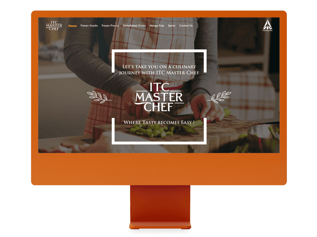
ITC
Giving a facelift to the ITC Masterchef website.
- Web Development
- User Interface Design
- User Experience Design
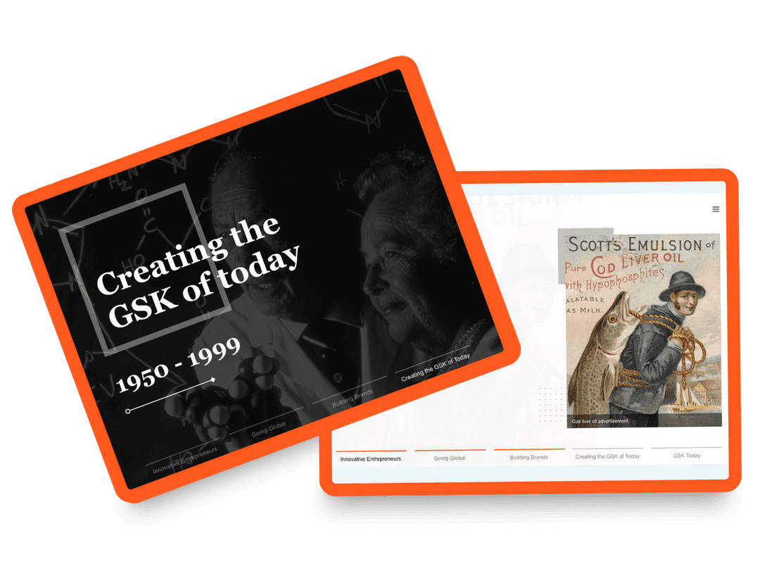
GSK
Interactive microsite for a healthcare giant.
- User Interface Design
- User Experience Design
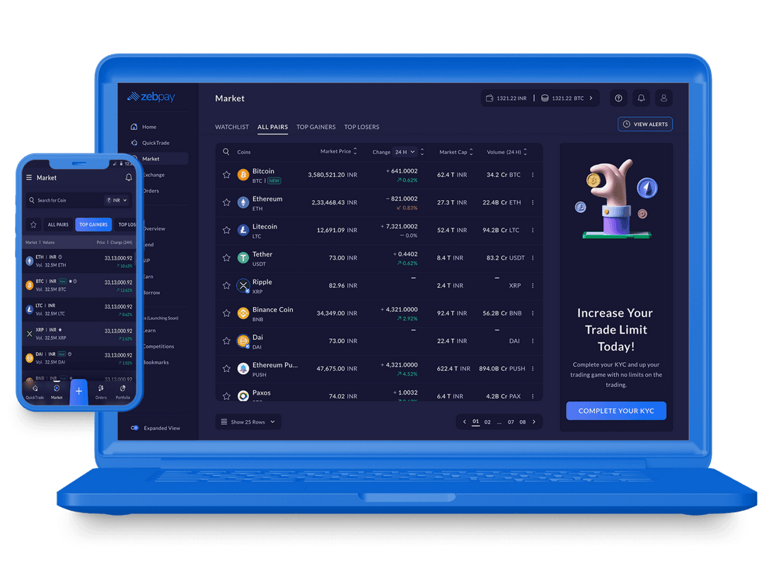
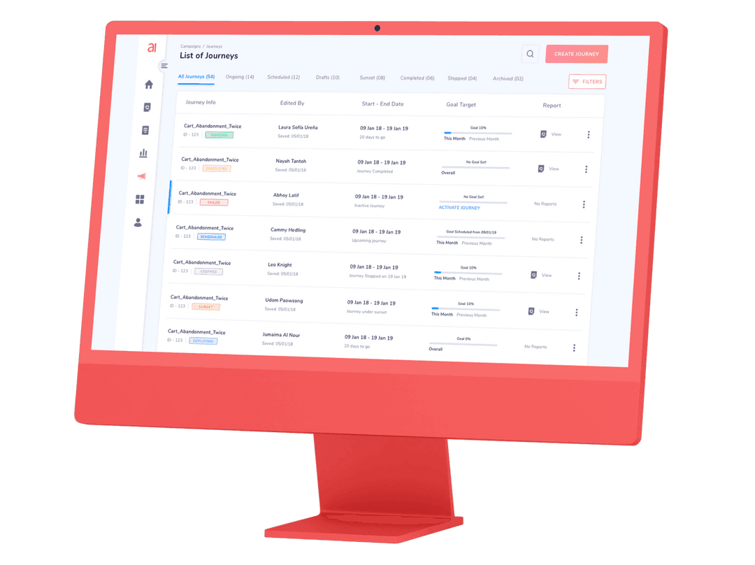
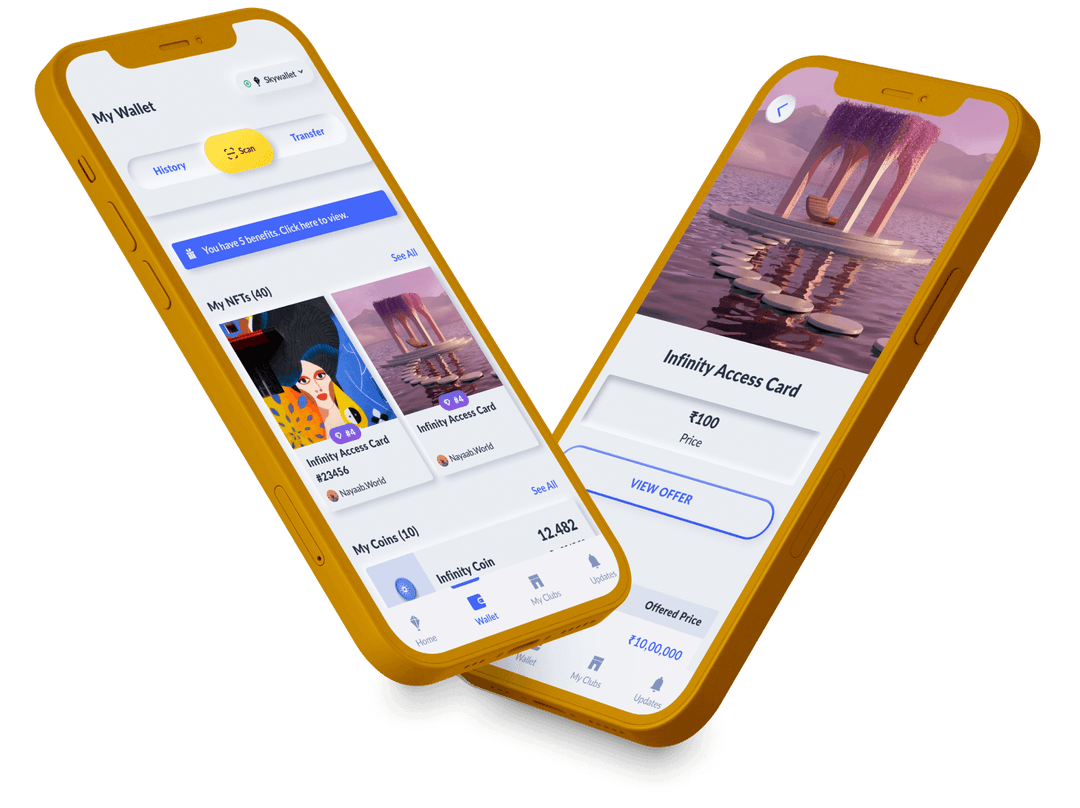
ZebPay
Bringing every individual to the blockchain revolution.
- User Interface Design
- Web Development
- User Experience Design
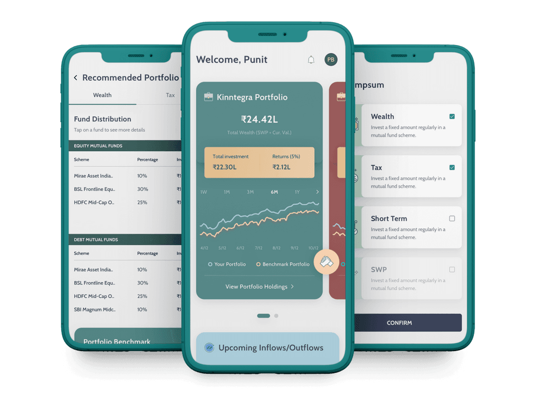
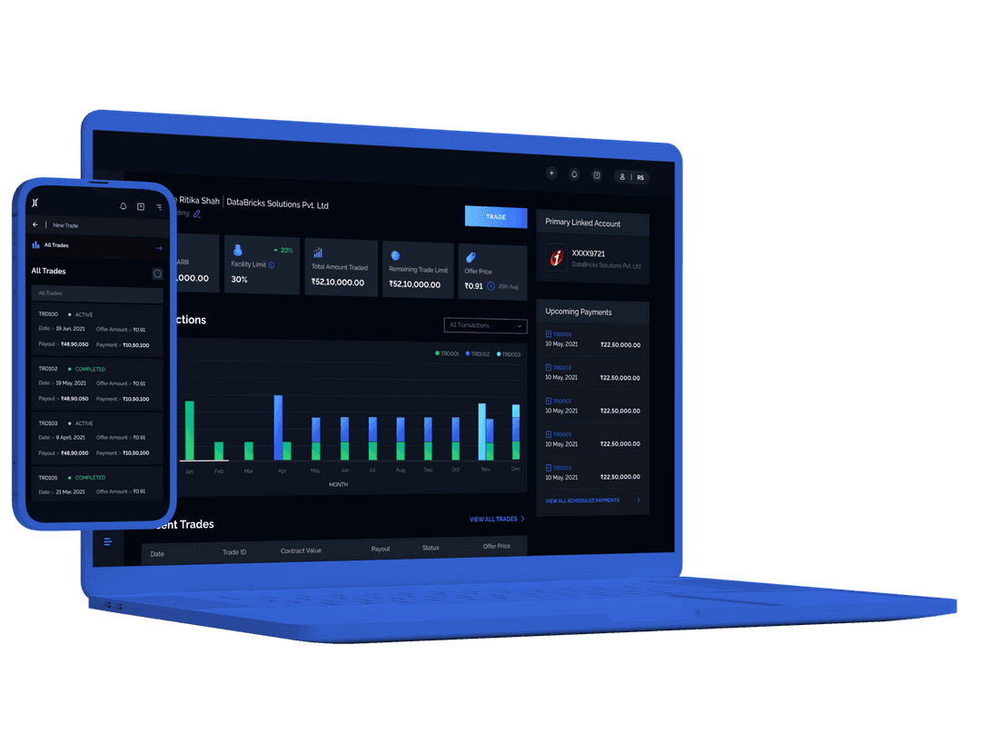
Kinntegra
Trading and Acquisition made efficient.
- User Experience Design
- User Interface Design
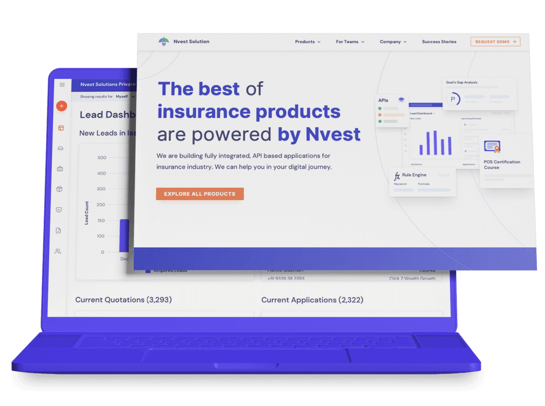
Nvest
Scalable UX for InsurTech Innovation.
- User Interface Design
- User Experience Design
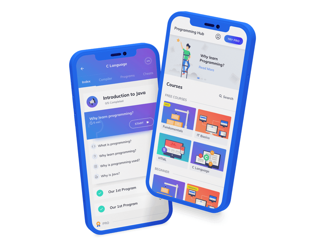
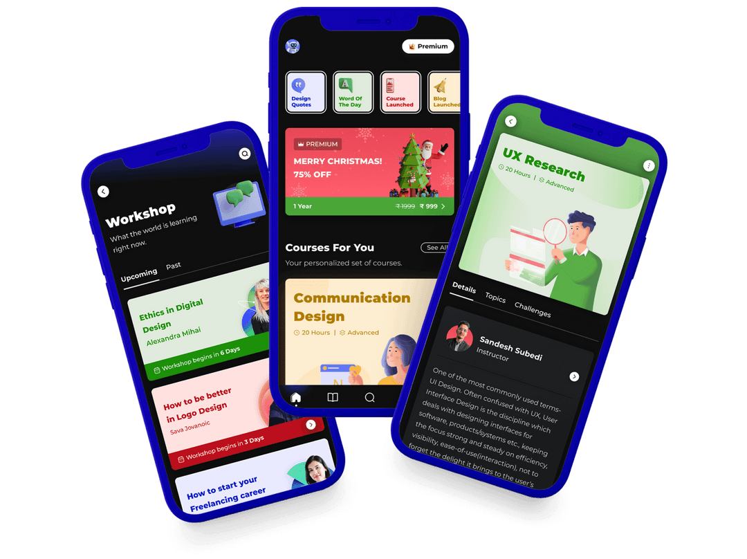
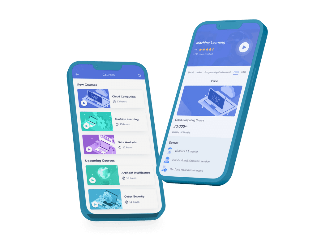
Programming Hub
Intuitive Design for Seamless Learning Experience.
- User Interface Design
- User Experience Design
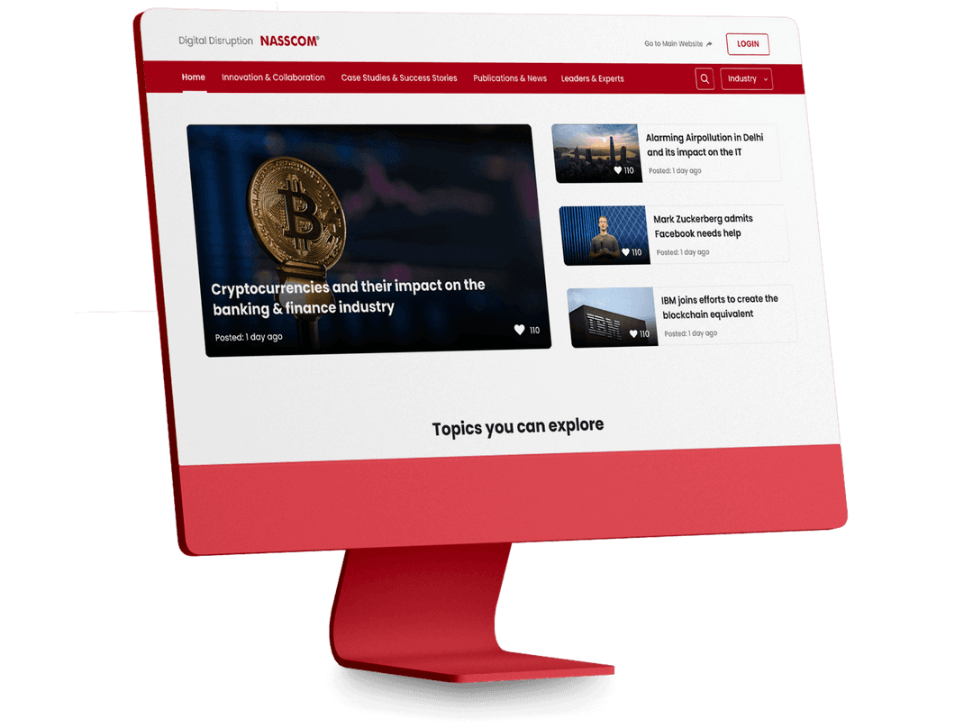
Nasscom
Thought leadership platform for the new age business.
- User Interface Design
- User Experience Design
Netcore
Designing Journey Builder for effective marketing.
- User Interface Design
- User Experience Design
- Web Development
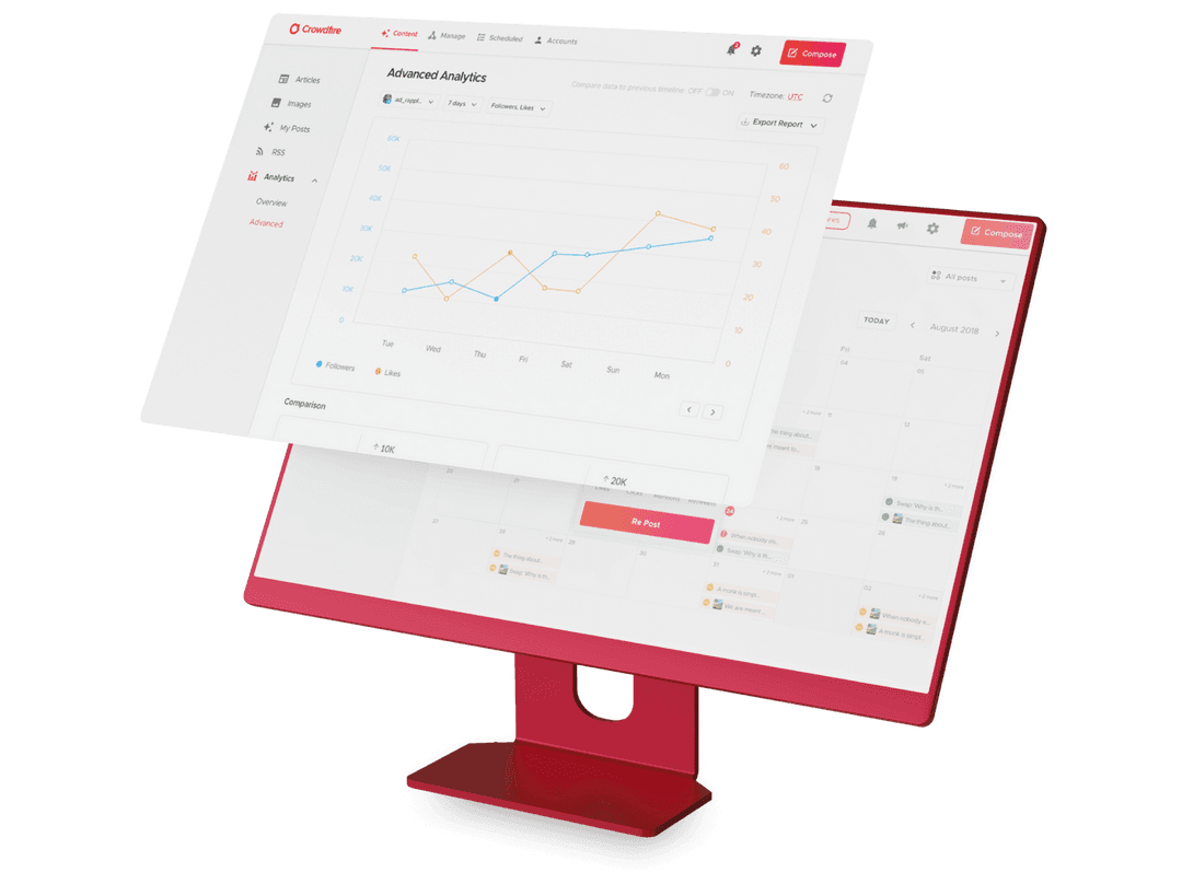
Crowdfire
Elevating the Social Media Management experience.
- User Interface Design
- User Experience Design
- Web Development
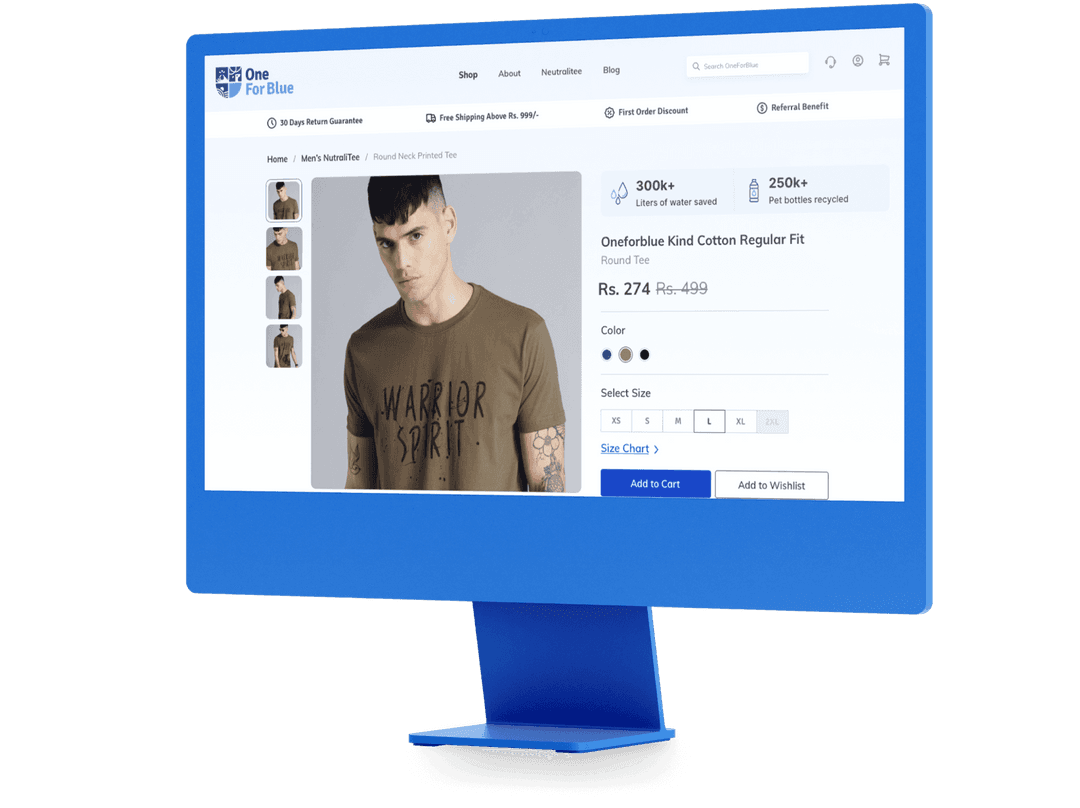
One For Blue
Designing for an Impactful Fashion Experience.
- Web Development
- User Experience Design
- User Interface Design
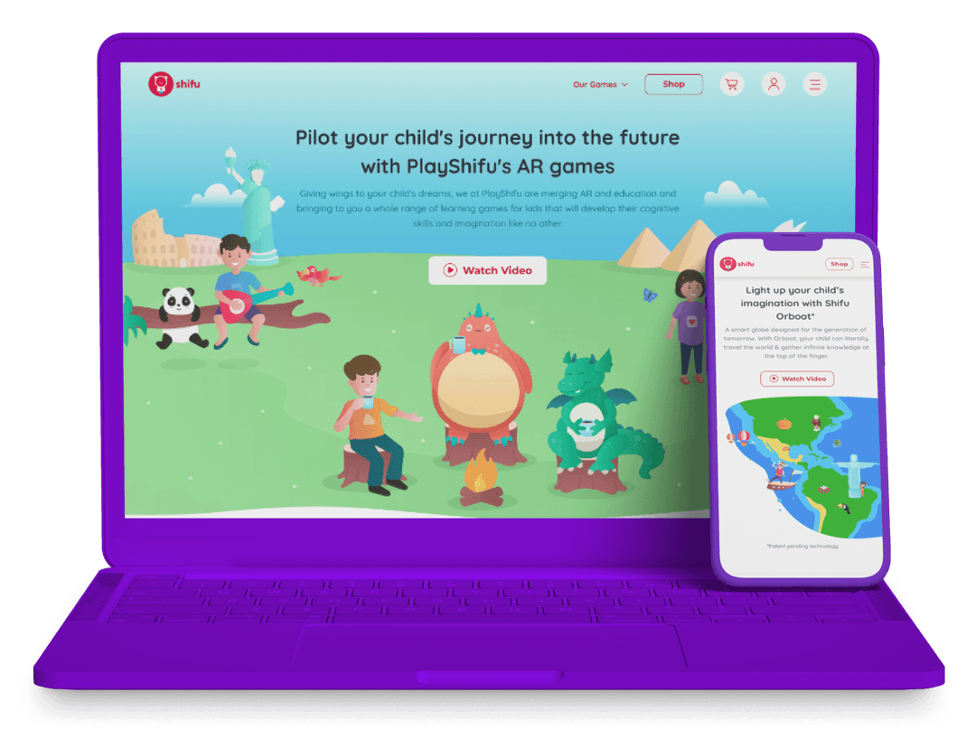
PlayShifu
AR-based Learning Made Engaging.
- User Experience Design
- Web Development
- User Interface Design
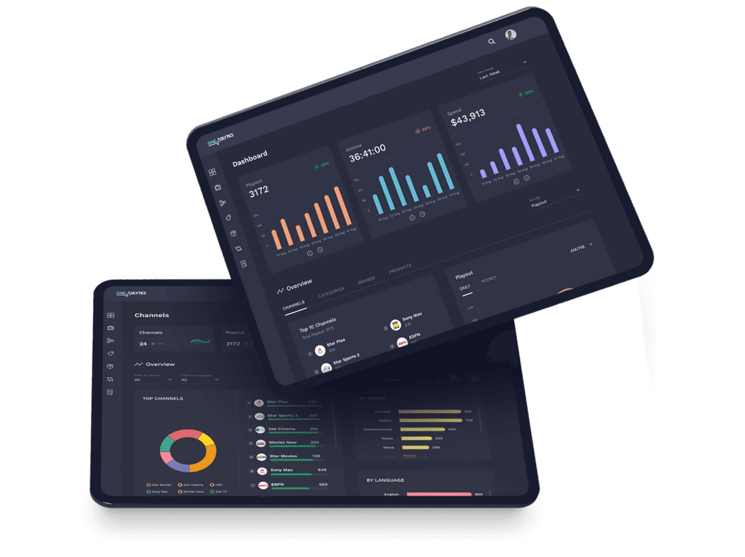
Sync Analytics
Demystifying the TV Audience Management Experience.
- Web Development
- User Experience Design
- User Interface Design
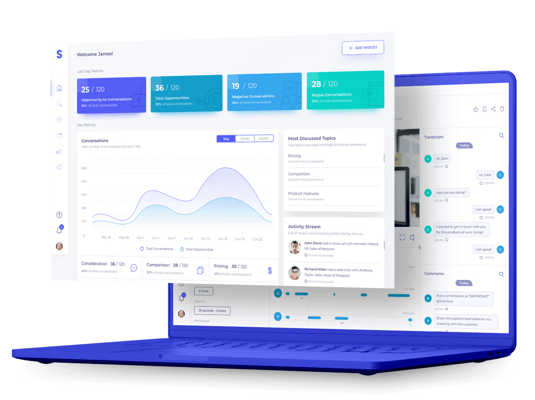
Scoop
Designing for Conversation Analytics and Sales Intelligence.
- User Interface Design
- User Experience Design
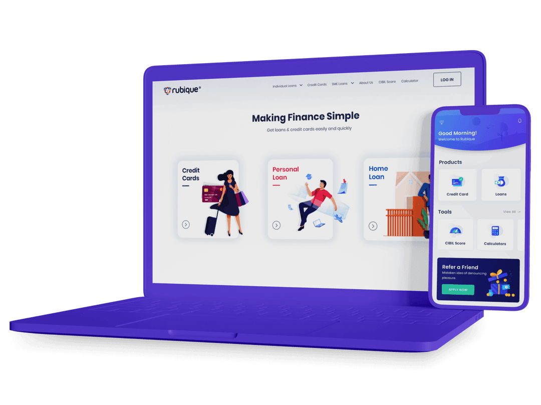
Rubique
Making Finance Simple & Effortless.
- User Interface Design
- User Experience Design
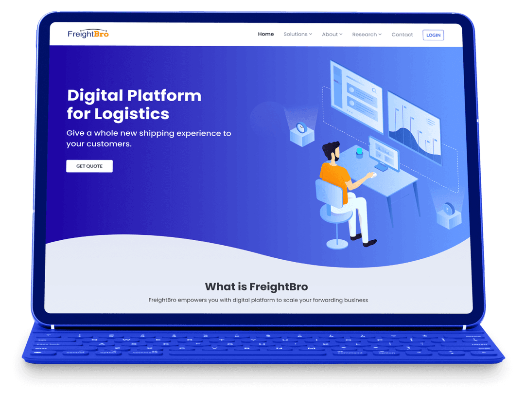
FreightBro
User-Driven Design to Simplify Freight Forwarding.
- User Interface Design
- User Experience Design
- Web Development
Metasky
Streamlining Web3 Adoption with User-Friendly Design.
- User Interface Design
- Web Development
- User Experience Design
CleverTap
Enhancing CleverTap's Navigation Experience.
- User Interface Design
- User Experience Design
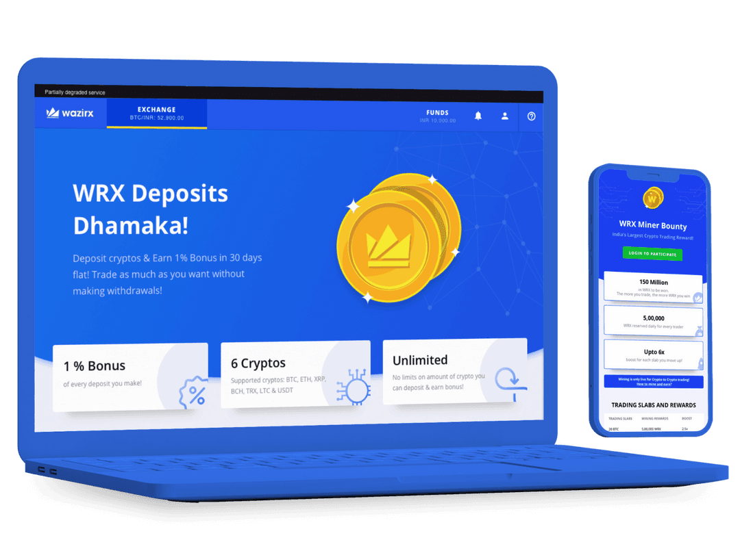
WazirX
Democratizing Crypto Trading For All.
- User Experience Design
- Web Development
- User Interface Design
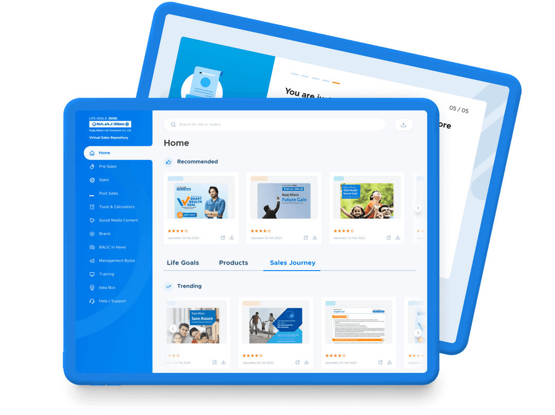
Bajaj Allianz
Boosting Sales with Marketing Assist Platform Design.
- Web Development
- User Interface Design
- User Experience Design
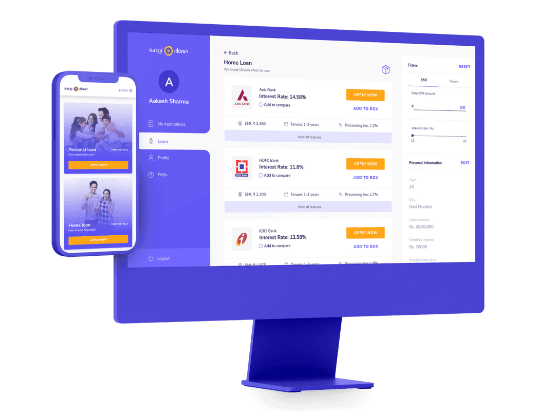
Sakal Money
Loan Application Portal for a leading Newspaper.
- Web Development
- User Experience Design
- User Interface Design
BridgeUp
Innovative Solution for Transforming Capital Access.
- User Interface Design
- User Experience Design
- No Code Development
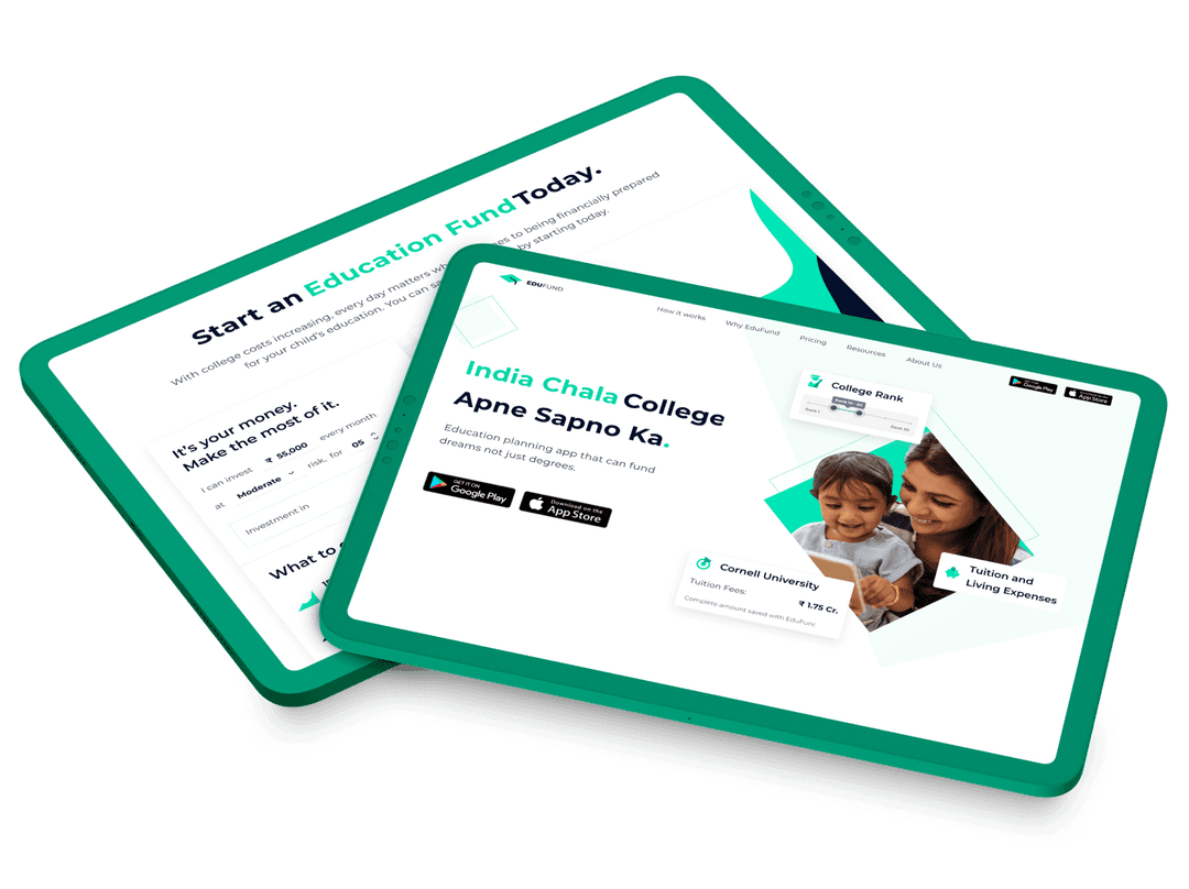
EduFund
Redefining Investment Advisory for Higher Education.
- User Interface Design
- User Experience Design
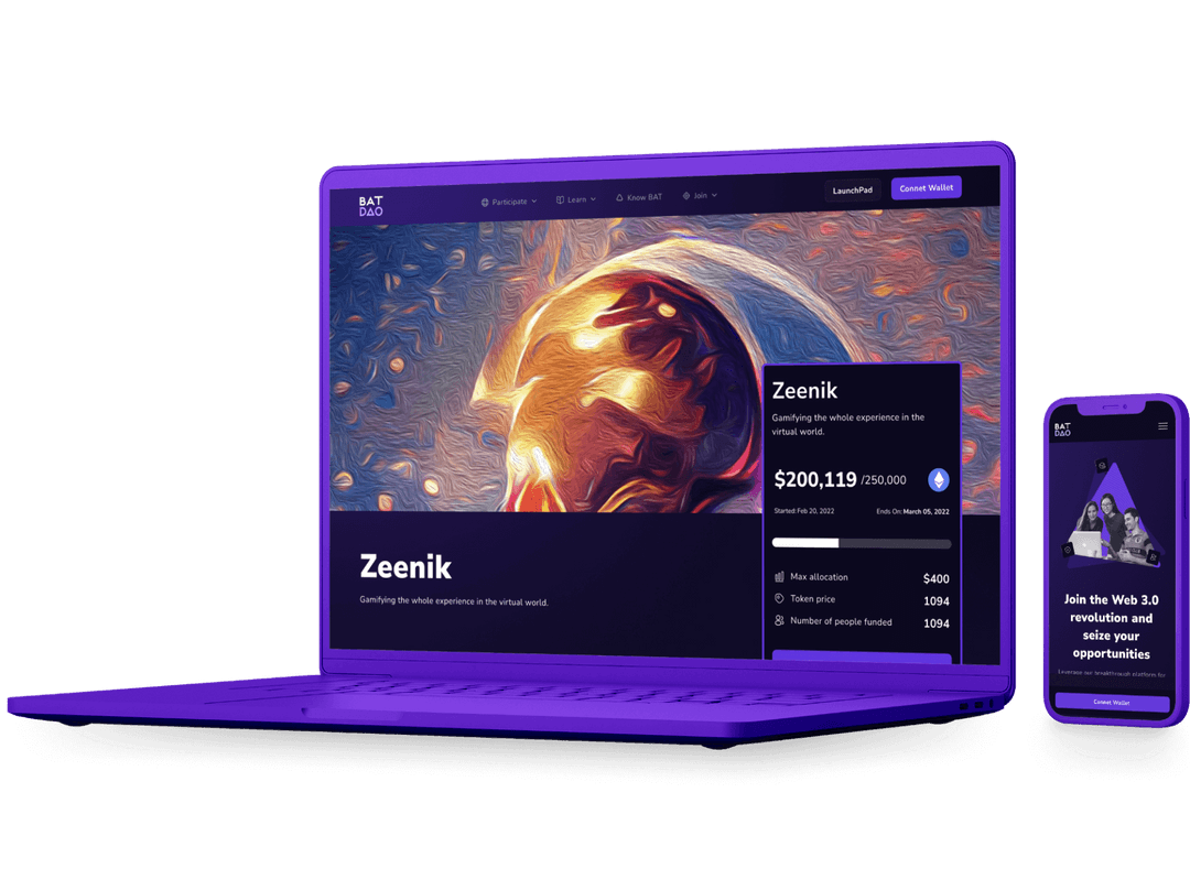
BAT - Basic Attention Token
Bridging Developers and Investors Efficiently.
- User Interface Design
- User Experience Design
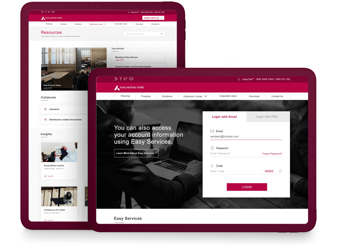
Axis Bank
Redesign for an intuitive banking experience.
- User Interface Design
- User Experience Design
ProApp
Revolutionizing Design Education with Engaging UX.
- Branding
- Mobile App Development
- Web Development
- Graphic Design & Illustrations
- User Interface Design
- Content
- User Experience Design
- BackEnd Development
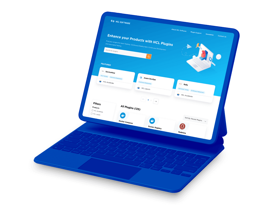
HCL Plugins
Modernizing HCL's Plugin Platform for Enhanced UX.
- User Interface Design
- User Experience Design
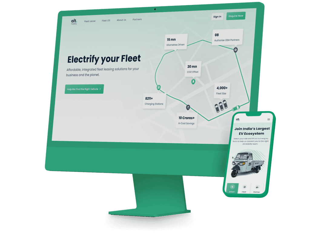
Alt Mobility
Revitalizing Alt Mobility with immersive UI.
- User Experience Design
- User Interface Design
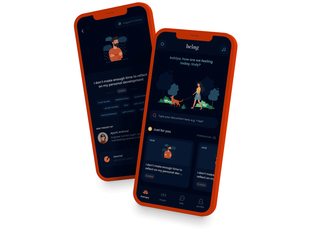
Being
Creating an accessible platform for mental health care.
- User Experience Design
- User Interface Design
- Graphic Design & Illustrations
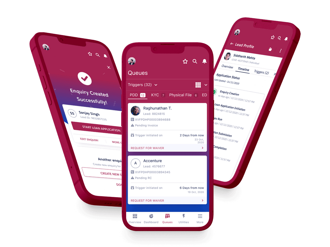
Cholamandalam
Reimagining Flow For Loan Origination System.
- User Experience Design
- User Interface Design
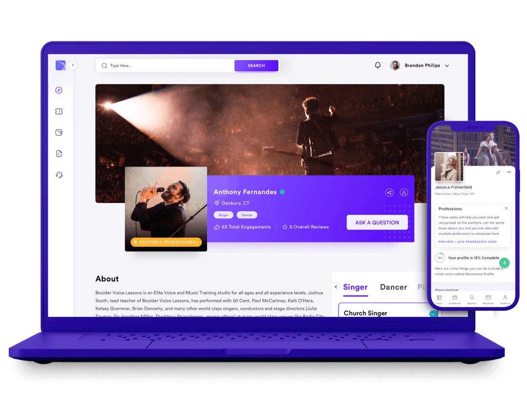
Resonance
Boosting artist visibility and engagement.
- User Interface Design
- User Experience Design
- Web Development
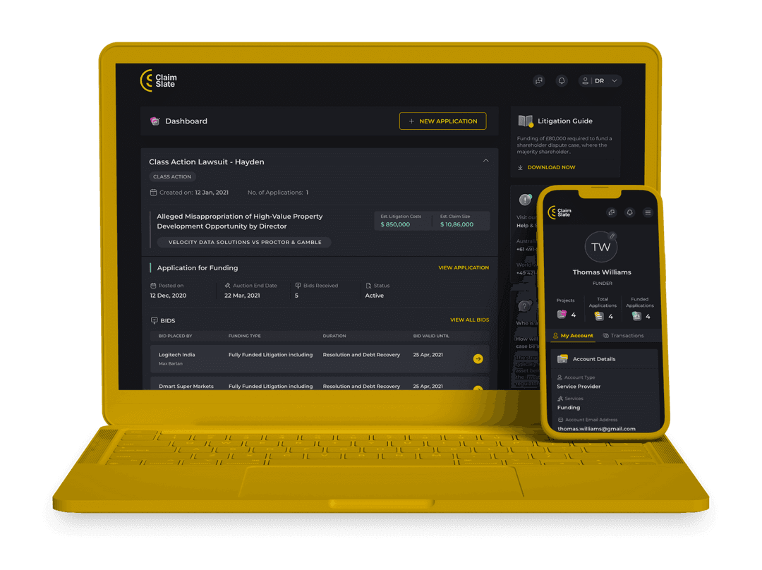
ClaimSlate
Transforming Litigation Financing.
- User Interface Design
- User Experience Design
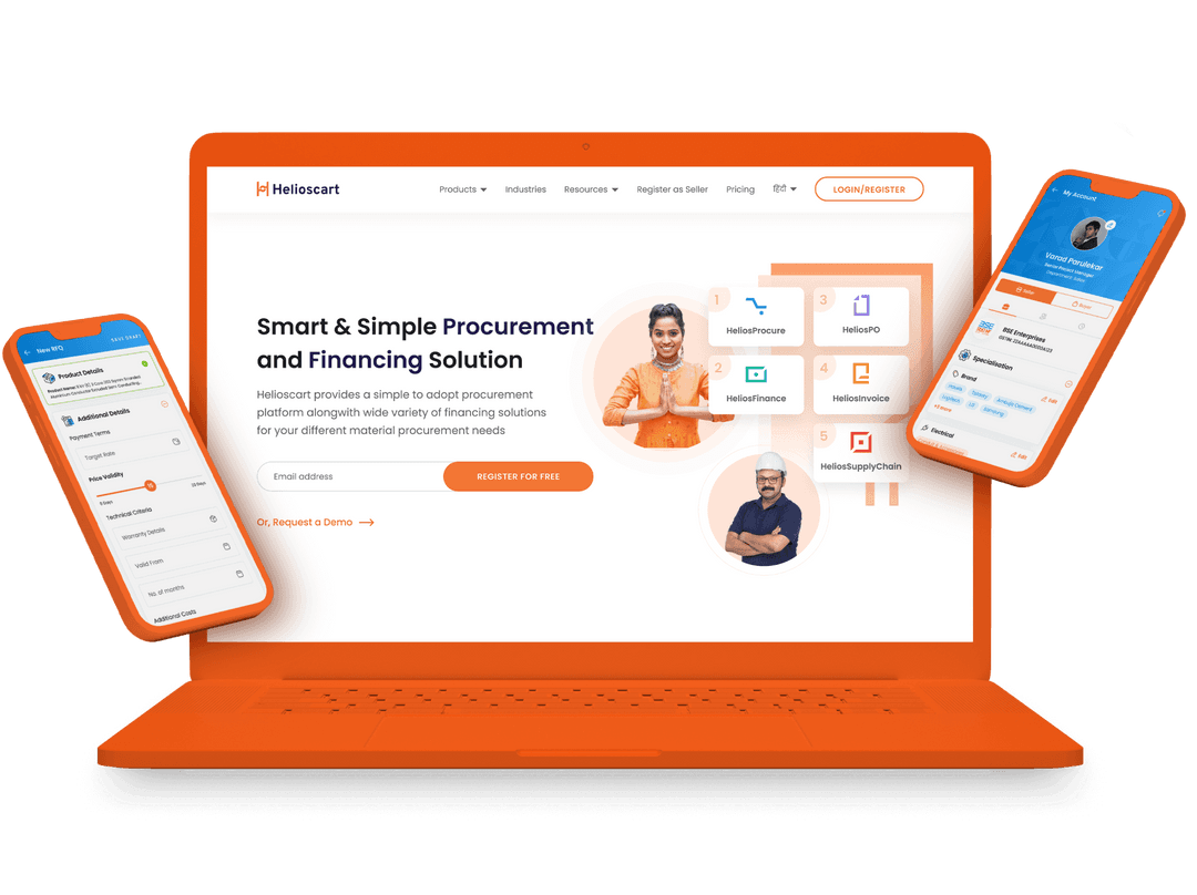
Helioscart
Designing for Procurement Digitization.
- Web Development
- Branding
- User Interface Design
- User Experience Design
Sealtabs
Digital System to enhance academic management.
- User Experience Design
- User Interface Design
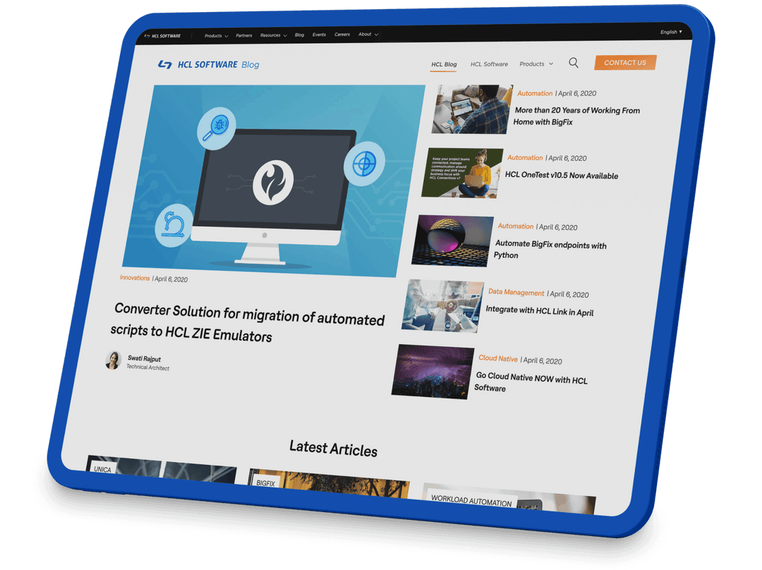
HCL Blog
Unifying HCL's Multi-Product Blog Platform.
- User Experience Design
- CMS/Wordpress Development
- User Interface Design
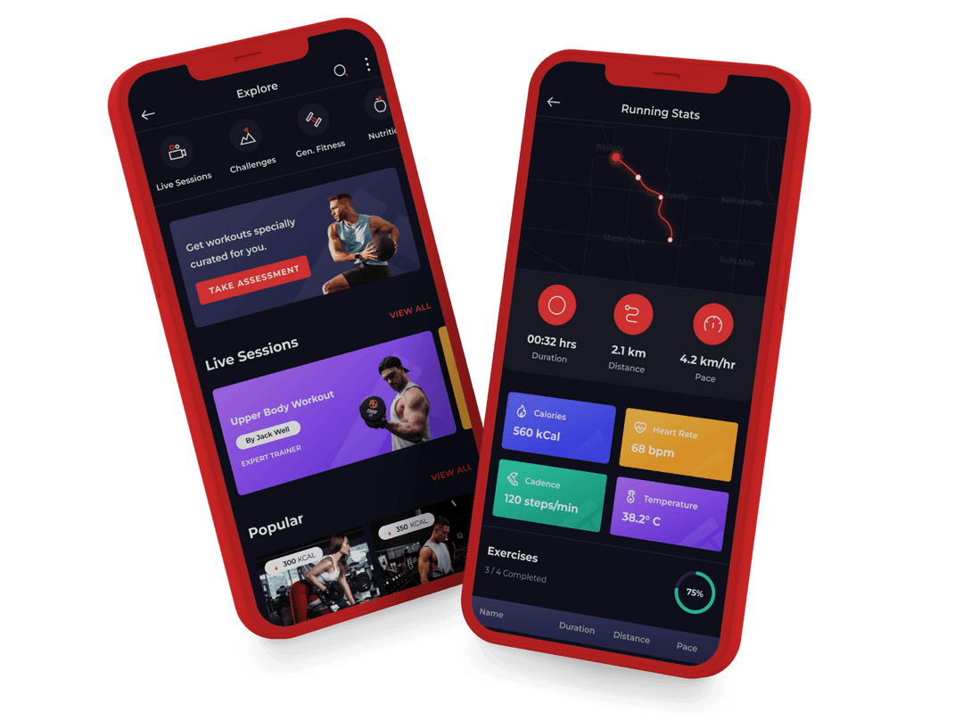
Fitpage
Data-driven Design for Personalized Fitness.
- Animation
- Branding
- User Experience Design
- User Interface Design
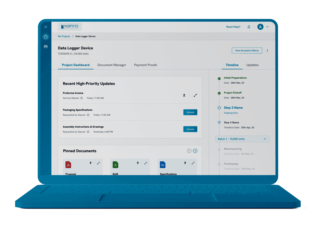
Napino
Designing to streamline customer onboarding.
- User Experience Design
- User Interface Design
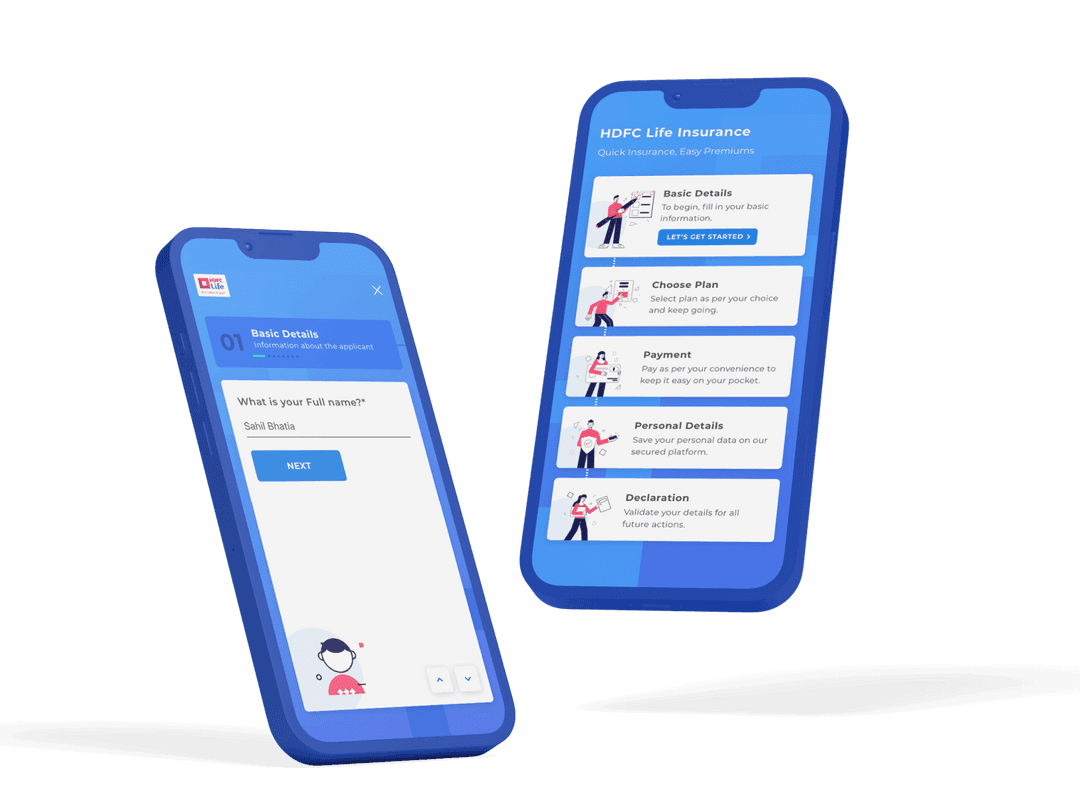
HDFC Life
Reimagining HDFC Life’s Digital Presence.
- User Experience Design
- User Interface Design
- Interaction Design
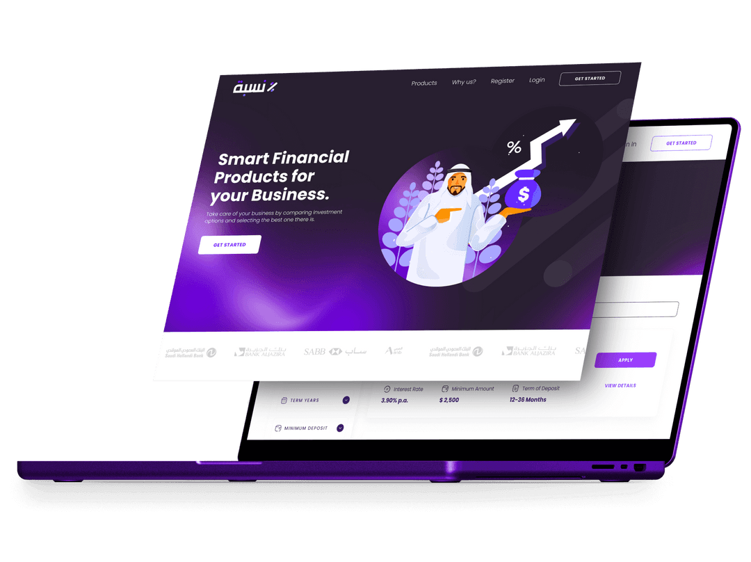
Nisbah
Revolutionizing Corporate Loan Procurement.
- User Interface Design
- User Experience Design
Lenexia
Tailored UX for Simplified Mortgage Management.
- User Interface Design
- User Experience Design
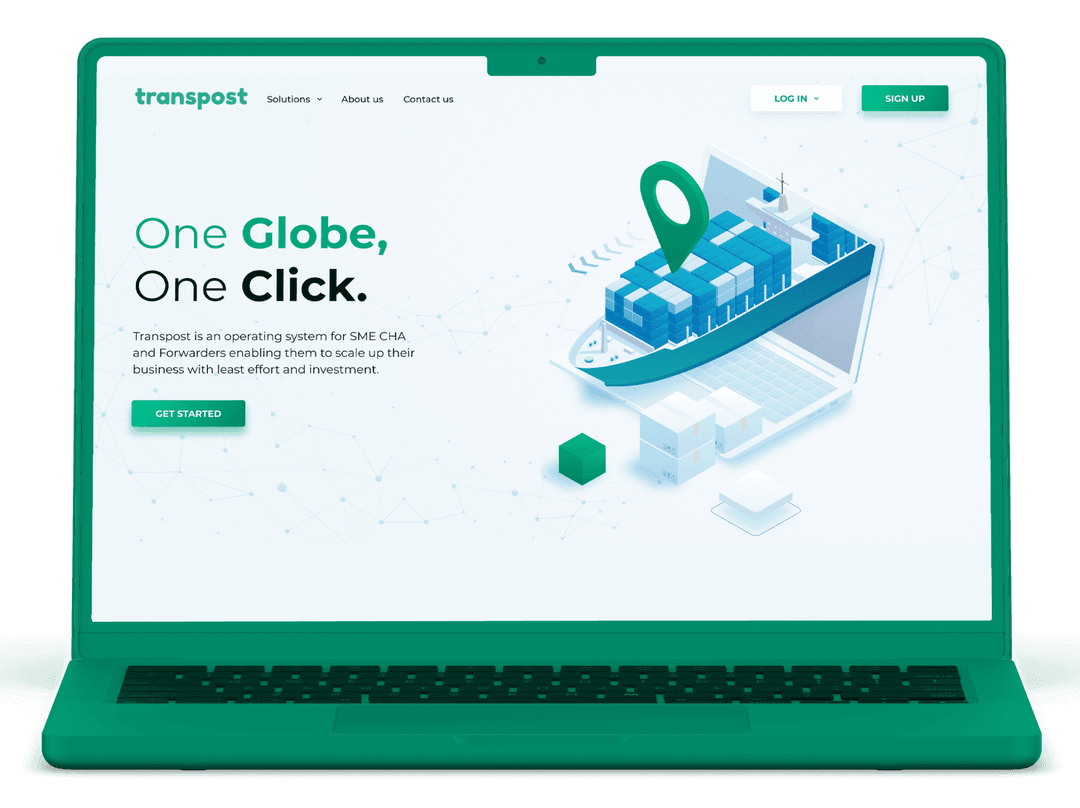
Transpost
Crafting an engaging web experience for Transpost.
- User Experience Design
- Graphic Design & Illustrations
- User Interface Design
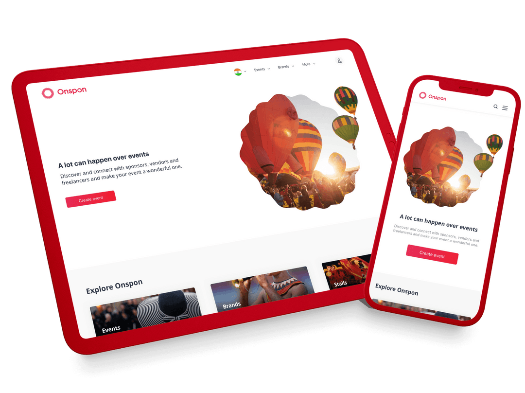
Onspon
Building A Comprehensive Hub For Event Management.
- User Experience Design
- User Interface Design
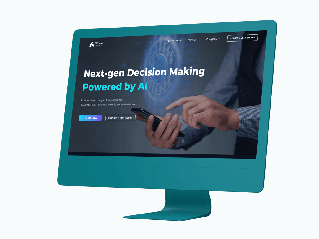
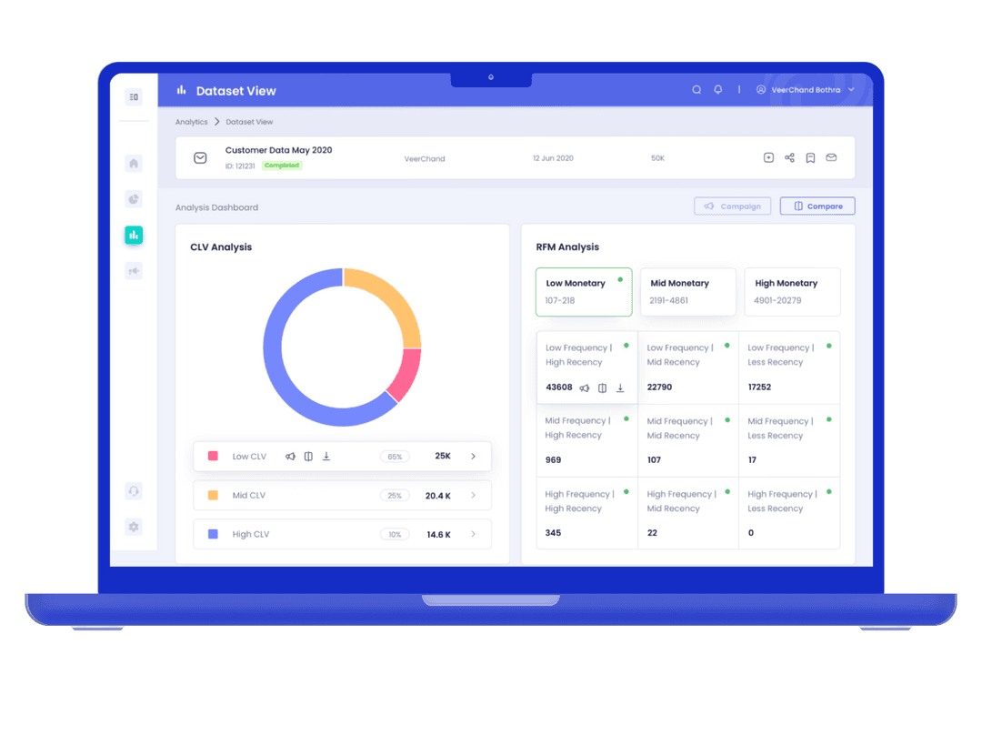
Impact Analytics
Simplifying data chaos for growth through design.
- User Interface Design
- User Experience Design

L&T
Building an interactive design for L&T
- User Interface Design
- Interaction Design
- User Experience Design
ProfitWheel
Empowering marketers with advanced data visualization.
- User Interface Design
- User Experience Design
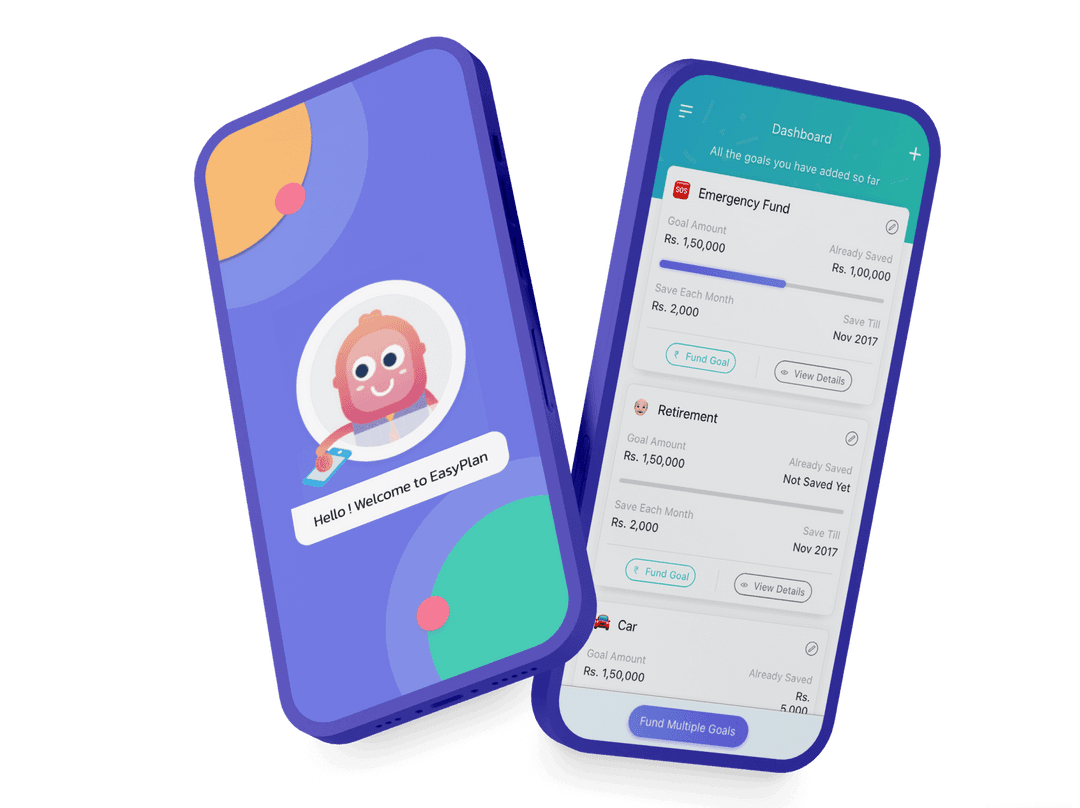
EasyPlan
Transforming Personal Finance with Gamification.
- User Interface Design
- User Experience Design
- Graphic Design & Illustrations
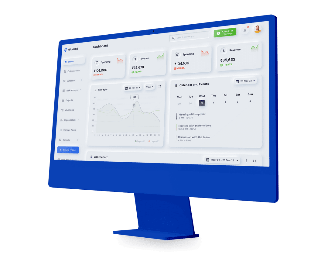
MangOS
Modern Visual Aesthetics for Complex Data Presentation.
- User Interface Design
- User Experience Design
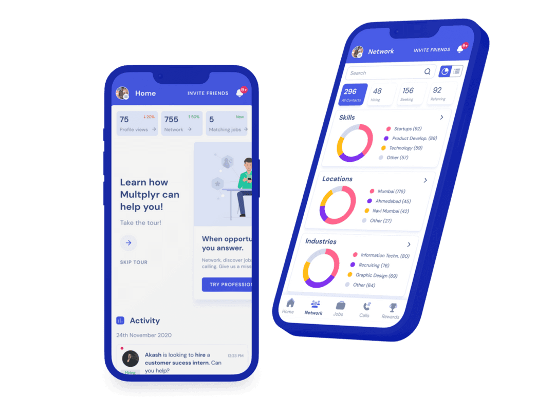
Multplyr
Bridging job seekers with trustworthy networks.
- User Interface Design
- User Experience Design
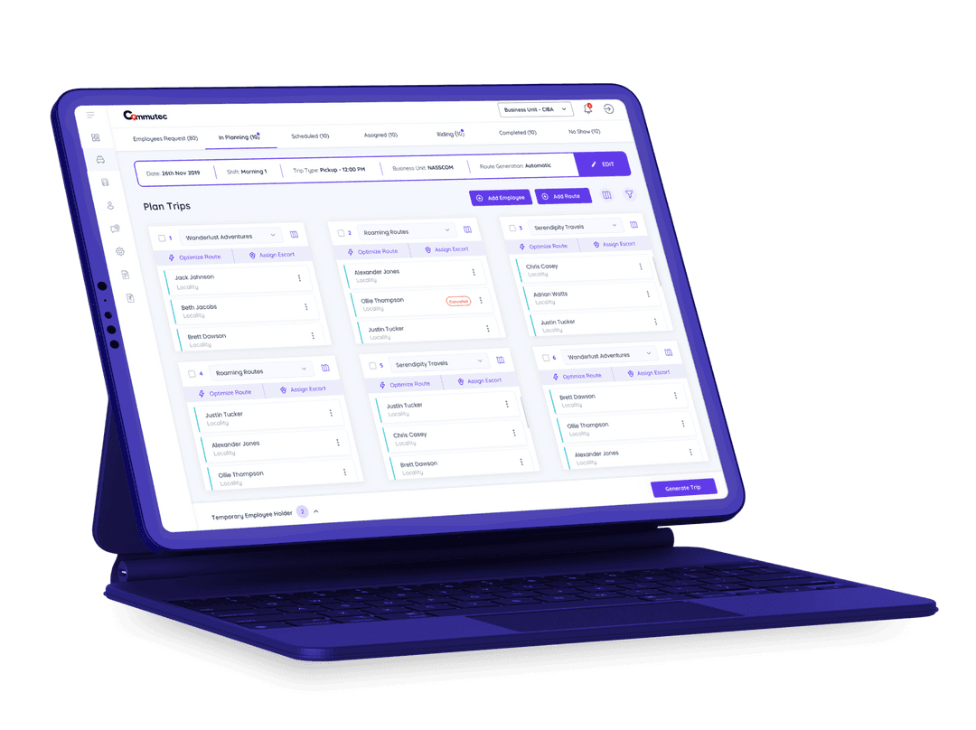
Commutec
Elevating Fleet Operations through Digital Solutions.
- User Interface Design
- User Experience Design
AI Educator
Designing to revolutionize AI-driven education.
- User Interface Design
- Branding
- User Experience Design
Filter by Industry & Services
OUR TRUSTED CLIENTS
Proud to deliver for Brands in


TESTIMONIALS
We Deliver What We Promise


 India
India Singapore
 USA
USA