We look at the color red, and the first thing that comes into our mind is- danger and warning. Color affects mood and generates emotions. Learning about color psychology is all about looking up for meaning, and perceptions that people make and have for different colors.

Understanding Warm and Cool Colors
Colors can be broadly categorized into warm and cool tones.
Warm colors
The sun and the fire evoke feelings of warmth, and the colors associated with these are called warm colors. Among the six primary colors- Red, Orange, and yellow and further combinations of these are warm colors. Warm colors are generally used by the entertainment or food industry.

Cool colors
The water and the sky evoke feelings of calmness and relax the mood, the colors associated with these are called cool colors. Blue, Green, and Purple are, and further combinations of these are cool colors. They are generally used in the tech industry and education sector.

Different colors evoke different emotions. Let’s find out how.
Color Meanings and Applications
Let’s dive into specific colors and their psychological impact
1. Color Psychology for Blue
The feelings of serenity and calmness are associated with the color blue. It symbolizes clarity, trust, dependability, security, and confidence. Industries like technology, education, airlines, banking, and many more. It is the most easily adapted color to the eye.

2. Color Psychology for Green
It’s the color of nature. It symbolizes harmony, growth, balance, health, harmony, and many such emotions that give the eye a soothing feeling. It is used for designing products from the agriculture, health, and fitness industry.

3. Color Psychology for White
It is associated with peace, innocence, and purity. White provides excellent help in designing clean interfaces. Remember the concept of using whitespace in User Interfaces. It is used for creating products for the Fashion, Media, Electronics, and Technology industry.

4. Color Psychology for Brown
It is associated with warmth, support, earthiness, and nature. Brown indicates reliability and generates confidence in the user’s mind. It is used for designing products for the construction, and textile industries.

5. Color Psychology for Purple
It reflects royalty, prosperity, and premium, and sets aside a unique identity of the user. It is generally used for designing products for the fashion, movie, and beauty industries.

6. Color Psychology for Orange
It is associated with enthusiasm, energy, encouragement, and determination. Orange is used for designing products for the hotel, construction, safety, and transport industry.

7. Color Psychology for Red
The color red projects strong emotions. It has to be used carefully, as it symbolizes energy, passion, and love, and at the same time, it is also a symbol of anger, danger, and warning. It is used for designing products for entertainment, food, gaming, or any industry that requires gathering the immediate attention of the user.

8. Color Psychology for Yellow
The color yellow portrays happiness, hope, and warmth, and just like red grabs the immediate attention of the user. You can use it as a cautionary color like the roadblock signs are yellow. It is used for designing products from the food, logistics, and retail industries.

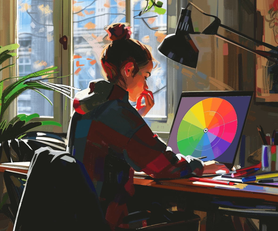
The Power of Color Palettes
Combining colors effectively is key. Consider:
- Complementary Colors: Opposite each other on the color wheel, these create a high-contrast and vibrant effect. Use them sparingly for emphasis.
- Analogous Colors: Neighboring colors on the wheel, create a harmonious and calming effect. Ideal for creating a unified brand image.
- Triadic Colors: Three colors are evenly spaced on the wheel, offering a dynamic and eye-catching combination. Best used strategically for a specific mood.
Understanding color psychology unlocks a powerful design tool. Ready to leverage color to elevate your user experience? Procreator Design, a leading digital design agency, can help. Our team of experts crafts color palettes that resonate with your brand and target audience. Contact us today to discuss your project!


