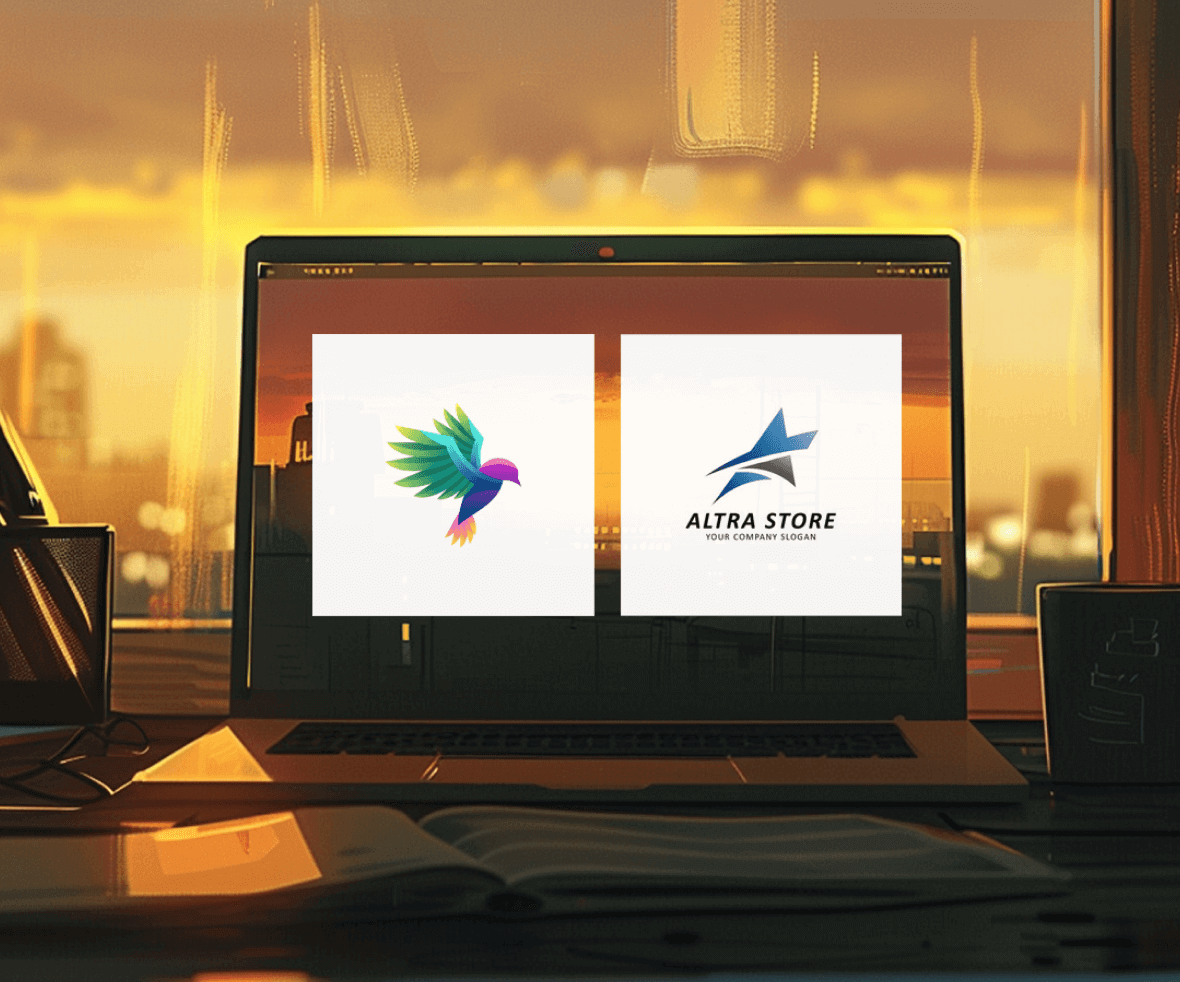
Icon and Logo are both used for visual representation. They help in recognizing and visually representing information. It is common to get confused between the two. There are some glaring differences between them, which sets them apart. So, what are those differences, the fight between an icon and logo, and can the term icon and logo be used interchangeably?
What is an icon?
An icon is a small, simplified graphical representation used to represent actions, concepts, or objects. Icons are commonly used in user interfaces to provide visual cues and make it easier for users to interact with software or applications.
Key Points for Designers:
- Clarity: Icons should be instantly understandable. Users should be able to grasp their meaning without confusion. Stick to universally recognized symbols when possible.
- Consistency: Maintain consistency in icon design across an application or website. Icons for similar actions or concepts should have a cohesive style.
- Size and Scalability: Icons need to be designed in a way that allows them to be displayed at different sizes without losing their visual integrity.
- Accessibility: Ensure that icons are accessible to all users, including those with disabilities. This may involve using alternative text or providing text labels alongside icons.
- Aesthetics: While functionality is crucial, designers should also consider aesthetics. Icons should complement the overall design and branding of the application or website.
Real-world Examples:
- Hamburger Menu Icon: Three horizontal lines stacked on top of each other represent a hidden menu that can be opened by clicking or tapping. This is a common icon in mobile app navigation.
- Trash Can Icon: A simple trash can icon is universally understood to represent deleting or discarding an item.
- Envelope Icon: An envelope icon typically signifies email or messaging functions in applications.
What is a logo?
A logo is a symbol, design, or emblem that serves as the visual representation of a brand, company, or organization. It is a crucial element in branding and marketing strategies as it helps create a unique and memorable identity for a business.
Key Points for Designers:
- Simplicity: A good logo design should be simple and easily recognizable. It should convey the essence of the brand in a clear and straightforward manner.
- Memorability: Memorable logos are more likely to leave a lasting impression. Designers should create logos that are distinctive and unique, making them easier to remember.
- Versatility: Logos should work well across various mediums and sizes, from business cards to billboards. It’s important to design logos that can be scaled without losing their visual impact.
- Color and Typography: The choice of colors and fonts in a logo can convey a brand’s personality and values. Designers should consider color psychology and typography carefully.
Some Real-world Examples:
- Apple: The Apple logo is a classic example of a simple yet highly memorable logo. It’s an apple with a bite taken out of it, instantly recognizable and associated with the brand’s innovation and quality.
- Nike: The Nike Swoosh is another iconic logo. It represents movement and speed, aligning with the brand’s focus on athletics and performance.
- McDonald’s: The golden arches of McDonald’s are instantly recognizable worldwide. They signify a sense of familiarity and fast food.
Differences between an Icon and Logo?
Difference 1
An icon has a significant responsibility for being identifiable and easy to recognize. While on the other hand, a logo needs to be different and not look similar to anything else in the market. This is because the main objective of any particular logo is to represent its corresponding brand and manage to do it effectively.

Difference 2
An icon should always be just a graphical symbol, whereas a logo can have text or a company’s name or value attached to it

Difference 3
Icons are sparingly used in the user interface to guide the user, help him/her navigate, and identify the everyday tasks across the website, while a logo is only used as a primary identifier and is mostly used in the headers of a website.

Difference 4
Icons are usually of a fixed size; otherwise, the quality might decrease. Logos that are created are generally vector-based; hence they do not lose quality.

Conclusion
Both icons and logos are powerful tools in visual communication, each with a distinct role. Understanding these differences helps designers create icon design logos that enhance user experience and strengthen brand identity. In today’s competitive market, professional icon and logo design can significantly impact brand recognition, with nearly 94% of consumers reporting they make purchasing decisions based on visual appeal.
Ready to elevate your brand identity? A professional digital design agency can help you create clear and memorable icons and logos. We specialize in crafting visual languages that resonate with your target audience and strengthen your brand. Contact us today to discuss your design needs!


