The human brain is fascinating. It can figure out structures and relationships, fill the gaps between the images, and form a structure out of it. From the field of psychology to Design, the Gestalt theory, also known as gestalt principles, of learning is implemented in various phases of design like User Experience Design, User Interface Design, Interaction Design, and other areas. Gestalt theory is based on the perception of the human brain.
Let’s learn about the Gestalt principles of perception with examples of gestalt principles applied in design.

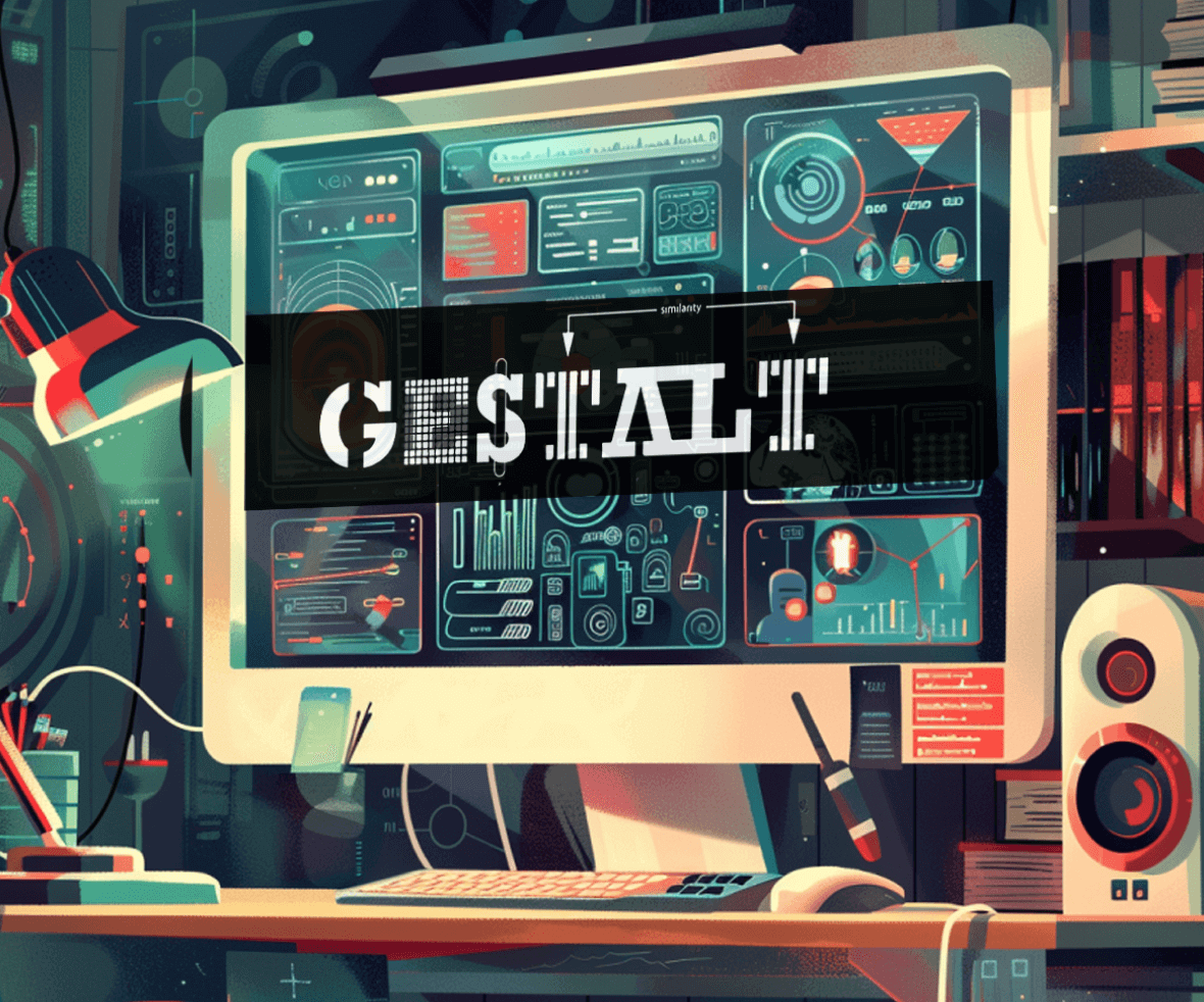
1. Law of Similarity
This principle states that similar objects on the interface are often considered as a part of the same group, by the human eye. It is achieved by using similar shapes, sizes, or colors. It enables the user to figure out the functionality behind the various interface elements.

2. Law of Proximity
The principle states, that the objects placed closed on an interface are perceived to be related to those set far apart. It can even override the similarity created by using the same colors or sizes. Sometimes placing the objects far apart creates a sense of negative space, which is useful to distinguish the objects from the rest.

3. Law of Closure
The principle states the eye can fulfill the gaps and patterns, perceiving the object as a whole. E.g., a triangle drawn using broken lines or empty spaces will still be understood as a triangle. This explains the brain’s capability of filling in the missing information to create recognizable details.

4. Law of Figure Ground
The principle states that we divide any visual into figure and ground. For example, the pro app logo showcases this by placing the object in the foreground, which contrasts against the background, drawing attention to it. This law is widely used in branding examples of gestalt principles.

5. Law of Common-Region
Following the footsteps of proximity, the law of common region explains that objects placed in the same enclosed area or space are perceived to be related. For instance, creating cards on interfaces depicting unique user profiles shows one of the examples of gestalt principles for grouping.

6. Law of Continuity
The eye tends to follow the objects placed on a straight or curved line more smoothly than at broken lines or angles. They are even perceived as connected and help in the smooth navigation of a website or an application.

Real-life examples of Gestalt Principles
1. Birds of the same feather stick together. Birds flying together in a group are often perceived as the same breed. This illustrates the law of the common region in examples of gestalt principles.

2. Google Maps is a real-life example of the Law of Continuity. The eye follows the straight line and makes it easy to navigate the path.


These crucial Gestalt grouping principles from the field of psychology have an impact on how we perceive things in our day-to-day lives. So, it is essential to learn about them when we design for everyday things.
Conclusion
Gestalt principles offer a powerful lens for understanding how users perceive and interact with interfaces. By incorporating these principles into your UI/UX design, you can create intuitive and visually appealing experiences that guide users effortlessly toward their goals.
Ready to harness the power of Gestalt and elevate your user experience? ProCreator is a team of passionate UI/UX design experts who can help you craft interfaces that are not only functional but also psychologically optimized for user engagement. Contact us today to discuss your project and discover how Gestalt principles can transform your design!


