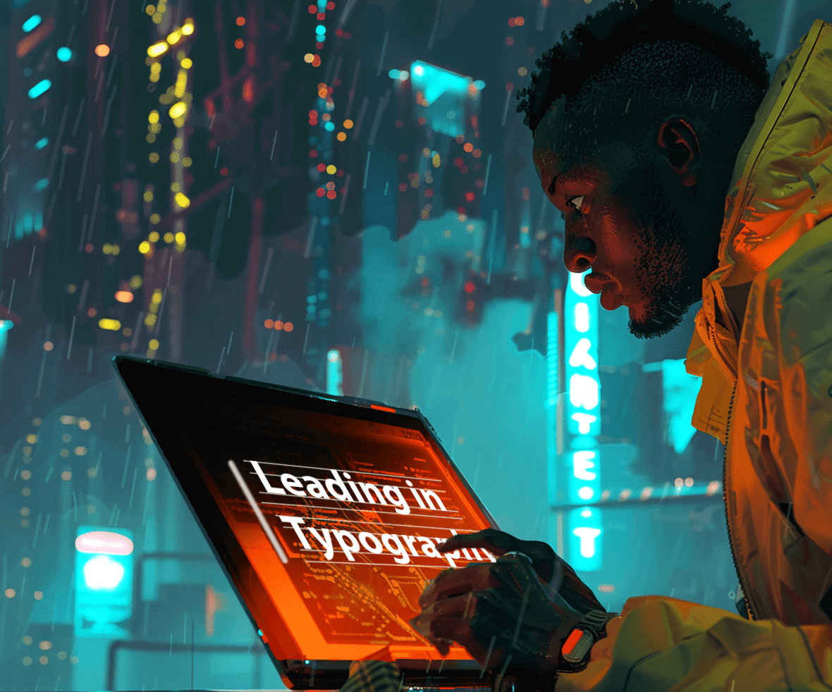
Have you ever struggled to read text crammed together on a website? Leading in typography is the magic space between lines that makes your text breathe and improves readability. Let’s dive deeper and explore why leading is crucial for creating a user-friendly experience. First, let’s start by understanding what exactly is leading.
What is Leading?
When we talk about typography, leading is the most commonly used term. What is leading in typography? It refers to the distance between the baselines of two lines of text. In simple terms, the space between the two lines of text is leading. Leading is extensively used in areas of User Interface Design. Correct spacing can make or break the interface. For example, tighter spacing values in newspapers can make text harder to read.
Why is leading crucial in typography?
Readability is an important aspect that should be taken care of when we talk about designing interfaces. To ensure readability, there must be enough distance between the bottom of the words of the previous line and the top of the words of the next line.
Typography isn’t just about choosing fonts, text size, and color; it also takes care of how the content is placed on the screen. Right leading ensures that the text is easy on the eyes. Text is easy to read if the leading is neither too loose nor too tight, as it conveys the message you intend the user to understand.
Purpose of leading?
Sometimes the way interfaces are designed is too heavy for the eyes. For a dark interface, it is recommended to use greater leading and light-weighted typeface, to enhance the readability of the interface. Similarly, different colors add different weights to the screen, making it difficult to even look at the interface. It can be fixed using correct spacing between the lines, leading.
How is leading measured in typography?
There is no correct way to measure leading. It is based on the context and the interface being used. Leading is measured in terms of tight or loose leading. A tight leading is generally used in print media and newspapers, where they have to provide too much information in a smaller amount of space. It also gives them an authentic look at the same time, making it chaotic for the eyes, and decreasing readability.
When preparing printed materials, especially for custom products or small runs, many professionals rely on print-on-demand software to ensure their typography choices translate seamlessly from screen to page.

Loose leading is easy on the eyes, ensuring a pleasurable reading experience. Whereas, too much line spacing also makes it difficult to read sometimes, as the eye will take a longer time to travel. Leading should always be measured in terms of the font being used.
What is negative leading in typography?
Tight Leading is also termed as negative leading. It happens when the point size chosen for leading is less than the point size of the type of font selected. For example, if the type size is 22, any chosen size less than 22 will be considered as negative leading. In some cases, the lines can overlap with each other as well.

How much leading shall you use?
So, how much leading is “just right”? Unfortunately, there’s no one-size-fits-all answer. The ideal leading depends on several factors:
1. The Type of Context
If the interface is for sole reading purposes, and there aren’t huge chunks of information to convey, then tight leading can be helpful. In such scenarios, the eyes do not have to travel a larger distance to read the next line of the text.

2. The Chosen Typeface
A lot is dependent on the typeface you are choosing. Fonts like Helvetica, where the x-height is more require more significant leading, to ensure that the eye follows the path.

3. The Size of the Typeface
We follow a calculation of 1.68*font size as a reference point for choosing the leading. Like, if the font size is 14, the leading would be 14*1.68 = 23.52. It is good to use something around 22 and 24.

You would have figured out till now how tweaking the text on the screen can provide you with a clean and readable interface Line Height vs. Leading.
Remember, the goal is to create a comfortable reading experience. Experiment with different leading values to find the sweet spot that makes your text breathe on the screen. Start with the 1.68x font size rule of thumb and adjust from there!
Line Height vs. Leading
Line Height
Line height, also known as “line spacing” or “line-to-line spacing,” refers to the vertical space between the baselines of two consecutive lines of text in a paragraph. It plays a significant role in readability and aesthetics. Line height is measured in various ways, such as a multiple of the font size (e.g., 1.2 times the font size), in pixels, or as a percentage of the font size.
Leading
Leading, on the other hand, specifically pertains to the space added to the baseline-to-baseline distance in typography. It’s often expressed in points and is primarily used in print design. Leading includes the space occupied by the letters themselves (ascenders and descenders) and any extra space added between lines.
The Relationship
Line height and leading are closely related but serve slightly different purposes. Line height affects the overall spacing within a paragraph while leading refers to the specific vertical spacing between lines. However, they both influence the readability and aesthetics of your typography.
Understanding examples of leading in design and how it differs from line height can help create balanced, readable interfaces.
Examples:
Balanced Line Height with Leading:
Let’s say you have a 12-point font size with a line height of 18 points (1.5 times the font size).
If you set your leading to 2 points, it means that the space between the baseline of one line and the baseline of the next line will be 2 points.
So, in this example, the total space between lines (leading + line-height) would be 20 points (2 points leading + 18 points line-height).

Different Line Heights and Leading for Text Variations:
In a design project, you might have a heading with a larger font size and tighter line height to create a bold, attention-grabbing effect.
|Text Hierarchy
Text hierarchy is a crucial aspect of typography that helps readers understand the structure and importance of content within a document. It involves the strategic use of different types of attributes to visually differentiate various levels of information.
Here are some key elements of text hierarchy
- Font Size: Use larger font sizes for headings and subheadings compared to body text. For example, you might use a 24-point font for a main heading, 18-point for subheadings, and 12-point for body text.
- Font Weight: Make important text elements, like headings, bold or heavier than the body text to draw attention.
- Color: Use color to distinguish different levels of content. Headings or important information can be a different color from the body text.
- Spacing: Adjust the spacing around text elements. For instance, you can add extra space above or below headings to separate them from the rest of the text.
- Typeface: Use different typefaces or font families for headings and body text. Ensure they complement each other and maintain consistency.
Example:
Let’s say you’re designing a blog post. You can establish a clear text hierarchy as follows:
- Main Heading: Use a large, bold font in a distinctive color.
- Subheadings: Slightly smaller font size, bold or italicized, with less spacing.
- Body Text: Regular font, smaller in size, with ample line height for readability.
- Quotes or Callouts: Use a different font style or color to make them stand out.
Creating a well-structured text hierarchy helps guide readers through your content, making it easier to scan and comprehend.
In conclusion, understanding what is leading in typography and how to apply it effectively is crucial for creating user-friendly designs. By experimenting with how to adjust leading for better readability and considering factors like context, typeface, and font size, you can enhance both the visual appeal and usability of your interfaces.
Ready to elevate your design projects with expert guidance and innovative solutions? Partner with the best digital design agency that understands the nuances of typography and can help bring your vision to life.


