Color is one of the essential elements in the field of design. It can provoke, evoke, and stir the emotions in humans. But the catch is to use them cautiously, and the interface should be in visual harmony with other elements. Different colors stimulate different kinds of emotions. It is essential to understand the role of color theory in all fields of design. Let’s start with graphic design.

What is Graphic Design?
Graphic design is the art of creating visual content to meet users’ needs, communicate specific messages, or solve a problem statement. Graphic designers make use of elements like colors, typography, and images to convey the necessary information and make it a cherishable experience for the user.
What is Color Theory?
Color Theory is a set of rules and guidelines we follow to create an aesthetic and harmonious color combination, which is both pleasing to the eyes and resourceful to use. It comprises segments like a color Wheel, color schemes, and color harmony. Let’s look at the various color schemes available and the psychology of color.
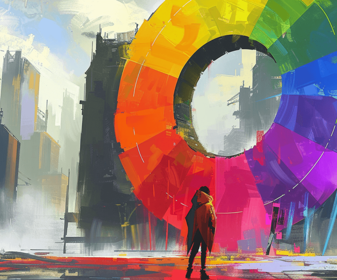
What is the Color Wheel?
The wheel that displays the relationship between various colors and the color schemes that follow after combining the colors is coined as a color wheel. There are three categories of colors on the color wheel.
- Primary Colors (Red, Yellow, and Blue)
- Secondary Colors (Mixing the three primary colors- Orange, Green, and Purple)
- Tertiary Colors (Combining primary and secondary- Yellow+Orange, Red+Orange, Red+Purple, Blue+Purple, Blue+Green, Yellow+Green).

Various Color Schemes
Different color schemes can be formed based on how you would want to combine the colors. Let’s read about some of the basics of them.
1. Complementary Color Scheme
This scheme uses colors opposite each other on the wheel (e.g., red and green). It creates a high-contrast and eye-catching effect, perfect for grabbing attention in website CTAs or packaging design.

2. Analogous Color Scheme
This scheme utilizes colors that sit next to each other on the wheel (e.g., blue, blue-green). It creates a more calming and cohesive feel, often used in minimalist design or branding for a sense of unity.

3. Triadic Color Scheme
This scheme employs three colors evenly spaced on the wheel (e.g., purple, orange, green). It produces a vibrant and dynamic effect, ideal for creating a playful and energetic brand identity.

How to use the Color Scheme in Graphic Design?
Using a color scheme efficiently in graphic design can influence the purchase of the buyer. Companies are utterly careful while creating logos. It helps them in building their brand identity as each color has its emotional impact.
1. Blue
Often associated with trust, security, and professionalism. It’s a popular choice for finance apps, social media platforms, and healthcare websites.

2. Black
Black stands for elegance and stability. It is mostly used by Gaming, design, and fashion industry.

3. Pink
Reflects femininity and a sense of emotions and comfort. It is used by the fashion or toy industry.

4. Red
Evokes feelings of excitement, passion, and urgency. It’s commonly used in call-to-action buttons, product packaging for bold items, or in the branding of fast-food restaurants.

5. Yellow
Yellow is a bright and cheerful color that often creates a sense of optimism and energy. It is used by the travel and food industry as well.

These were some of the examples. All color generates emotions, and it is necessary to choose which connects best with your user. Graphic design is all about connecting with the user and creating interfaces that add value to the product they are using.
Here are some of the links for your reference. They will surely help you in choosing the correct color that suits your needs.
Color theory is a powerful tool that can elevate your graphic design projects to new heights. From crafting eye-catching logos to building user interfaces that resonate on an emotional level, understanding color theory equips you to create impactful and memorable experiences.
Ready to put color theory into practice? Partner with our digital design agency to craft a visually stunning brand identity! Our team of experienced designers will help your brand with stunning designs. Let’s create something truly remarkable together!