Buttons are the essence of any interaction when made in terms of any digital User Interface. They seem to be simple UI elements that should be efficient and Interactive, and improve user experience – for better User Experience and efficient interaction. In today’s blog post, we’ll be covering the basic rules we at ProCreator, a prime UIUX design agency follow for creating buttons and button designs.

Basic Rules for Button Design
Buttons are the gateways to action in your interface – here’s how to design them effectively.
1. Making Buttons Recognizable
Just imagine checking a website where buttons blend into the background, their purpose shrouded in mystery. Frustrating, right? Users shouldn’t have to decipher what’s clickable. Here’s how we ensure crystal-clear button recognition:
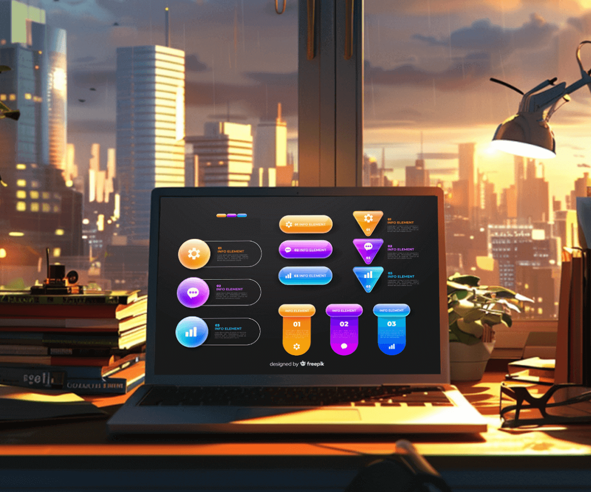
What makes buttons look like buttons?
While interacting with an interface, it shouldn’t be difficult for the user to identify what is clickable and what isn’t. It shouldn’t be on the user to decode the meaning or functionality of the button. There are various ways in which this can be achieved.
- Shape & Size: Use the existing and adapted shapes that the user is already aware, of from prior experiences. Like, square, square with rounded corners, or using depth or shadows with the rectangle. Flat design is popular these days but should be used intelligently as it gets difficult for the user to identify if the button design is clickable or not.

How big should mobile buttons be?
For seamless navigation, the button design should be sized correctly. Size also decides the priority of an action related to the button. Especially for mobile UI, it should be a finger-friendly interaction. The button’s size should vary from 42 px to 72 px.
- WhiteSpace:Surround buttons with sufficient whitespace to distinguish them from surrounding elements, which helps improve user experience.

2. Positioning for Optimal User Flow
As mentioned before, it isn’t a user’s job to search for buttons. They should be positioned as per the UI guidelines. The correct position can easily be achieved via testing. Build a clickable framework- notice and record the user’s timing and see if they are taking more than the required time to look for the button.
For example,
- “Next” on the right, “Back” on the left.

- Clear Labels: The action associated with the button should be clearly mentioned. Add effective labels to the button to ensure that the user understands the use case. Don’t focus on making it too witty, sometimes a simple OK or CANCEL will perform the necessary task.

3. Consistency is Key
The user tends to associate a particular action with the shape of the button provided. For example, if OK is represented by a square button in one place, it should be a square in all other places. The same goes for the consistency of color.
If hovering over the CANCEL button changes its color to red, then it should be consistent across the application or the webpage. Visual consistency is one of the essential features of good design.

4. Hierarchy
One of the most common and basic design principles is hierarchy. It should be like a conversation with the user. Amazon has placed its Add To Cart Button in a single place on the product page. However, for the ease of the user, it should be placed towards the bottom as well.
People tend to scroll down for descriptions and have to scroll up to get back to the Add To Cart button. In terms of hierarchy, it is correct but fails in terms of positioning.

5. Less is More: The Power of Limited Choices
Use only specific (ideally one, maximum two) and a limited number of buttons. When too many options are provided, the user ends up quitting. Buttons should be used for the most important actions on the page.
For example, while signing in to a website, the Login button is necessary, but the SignUp can be a link on the same page. On the next page, Sign Up, can be a button.

6. Mobile Button Spacing
Ranging from 12px to 48px is the standard range suggested for button spacing. It includes both the low-priority buttons design and the high. Incorrect spacing lowers the touch accuracy for your product or application.
7. Providing Necessary Feedback: Keeping Users Informed
Users should always be informed of the repercussions of the action they are about to take. This is focused on another crucial Design Rule- Providing Feedback. The feedback can be in the form of an audio or a visual. Like, while deleting a file, you can hear the crushing sound of the paper, which ensures the user that the file has been deleted.
Buttons are an important element for Interaction Design. They look simple but are worth paying attention to. They enable seamless user navigation through the product. Make buttons useful.
8. Buttons: Small Elements, Big Impact
Buttons, though seemingly simple, deserve careful consideration. They orchestrate a user’s journey through your product. Make them clear, functional, and strategically placed. Let’s create intuitive and effective button designs together, crafting a user experience that surpasses expectations.
Recommended Reading
Revolutionize your UI/UX with the expertise of the best digital design agency. Elevate your digital interactions through intuitive and effective button designs that improve user experience. Join the best UI UX design agency for a seamless user experience that transcends the ordinary!