What is imagery?
An image speaks a thousand words — the most common proverb we use to describe the importance of an image. Imagery in UI design is the visual language used to help users relate to a brand, and their products, adding an interactive element in the form of an image.
Imagery in literature is a language that appeals to one or more of our five senses, enhancing the reader’s experience through vivid descriptions. Using images enhances the experience for the user by simplifying the complex concepts by reducing them to pictures. The human brain processes images almost 50,000 times faster than text.

Here are some common types of imagery in UI design:
1. Hero Images
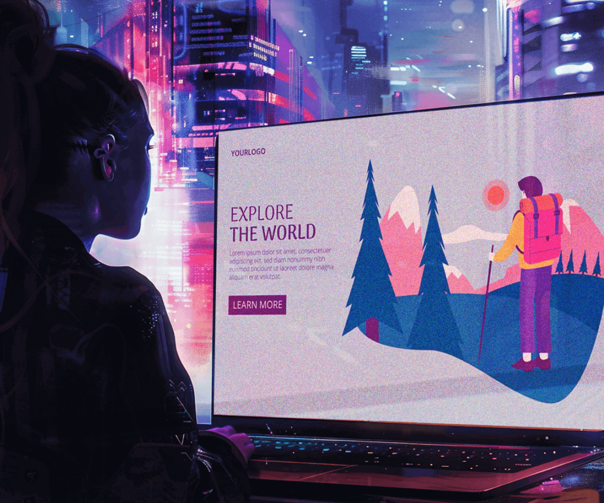
Large, impactful images grab the user’s attention at the very beginning of your interface. They are often placed on landing pages or banner sections.
2. Product Images
Showcase your product in its best light. Use high-quality photos from various angles to give users a clear understanding of its features and functionalities.
3. Illustrative Imagery
Use illustrations to explain complex concepts, add a touch of personality to your design, or create a specific mood or theme.
4. User-Generated Content (UGC)
Images or videos submitted by your users can build trust and social proof. Consider incorporating UGC strategically into your design.
Now that we’ve explored different types of imagery in UI design, let’s delve into some key considerations when selecting images for your UI design.
1. Equal size
Appropriate position & size for your images.

2. Alt text
Images should always have an alternative text attached to it. It still conveys the necessary information when the image fails to load.

3. Structured image
Every image should work as a story-teller for your interface, by conveying information in a structured, more accessible, and pictorial fashion.

4. Scalability
It shouldn’t be a distorted image, as it creates negative visual noise. It should be of perfect resolution and scalable across multiple devices.

5. Rule of Thirds
An image should constitute a point of focus. It introduces meaning to it.

6. Color blend
The color and the characters we use should blend well with the design aesthetics of our website or application.

7. Thumbnails
Introducing thumbnails (smaller images) is a good practice for providing a user with the context of what a video or an article is about in your design. You can place them over cards and can set different sizes and proportions for them.

8. Emotional response
The imagery evokes an emotional response from the users. In other words, it helps the user establish a connection with your interface.

9. Tutorials
Images are best used for creating tutorials of your product. Utilize images on the landing screens. It attracts the user and has high conversion rates of users as compared to if there are just texts on the screen.

In conclusion, typography and imagery are the unsung heroes of exceptional user experiences. Just like perfectly chosen fonts tell your brand story, captivating visuals engage users and guide them through your product seamlessly. But crafting this visual symphony requires a keen eye and an understanding of user behavior.
Ready to elevate your design and create an unforgettable experience for your users? Look no further than the best UI UX design agency! At ProCreator, our team of UI/UX design ninjas are experts in crafting user journeys that are both beautiful and intuitive. We’ll help you harness the power of typography and imagery to create a design that not only looks stunning but also converts.

