Healthcare is evolving—and so should your app.
In the post-pandemic world, digital healthcare isn a necessity. With global healthcare spending expected to surpass $5.3 trillion by 2025, the demand for intuitive, secure, and user-friendly health apps has never been higher. But here’s the kicker: creating an app that users trust and engage with isn’t just about flashy features—it’s about exceptional UI design.
Think about it. Would you trust an app to monitor your health or store your medical records if it’s hard to navigate or visually overwhelming? The answer is simple: No. That’s why UI design plays a pivotal role in creating health tech apps that are not only functional but also instill trust and confidence.
In this blog, we’ll explore five practical tips for crafting health tech apps that users love, backed by real-world examples and expert insights. Ready to dive in? Let’s start.
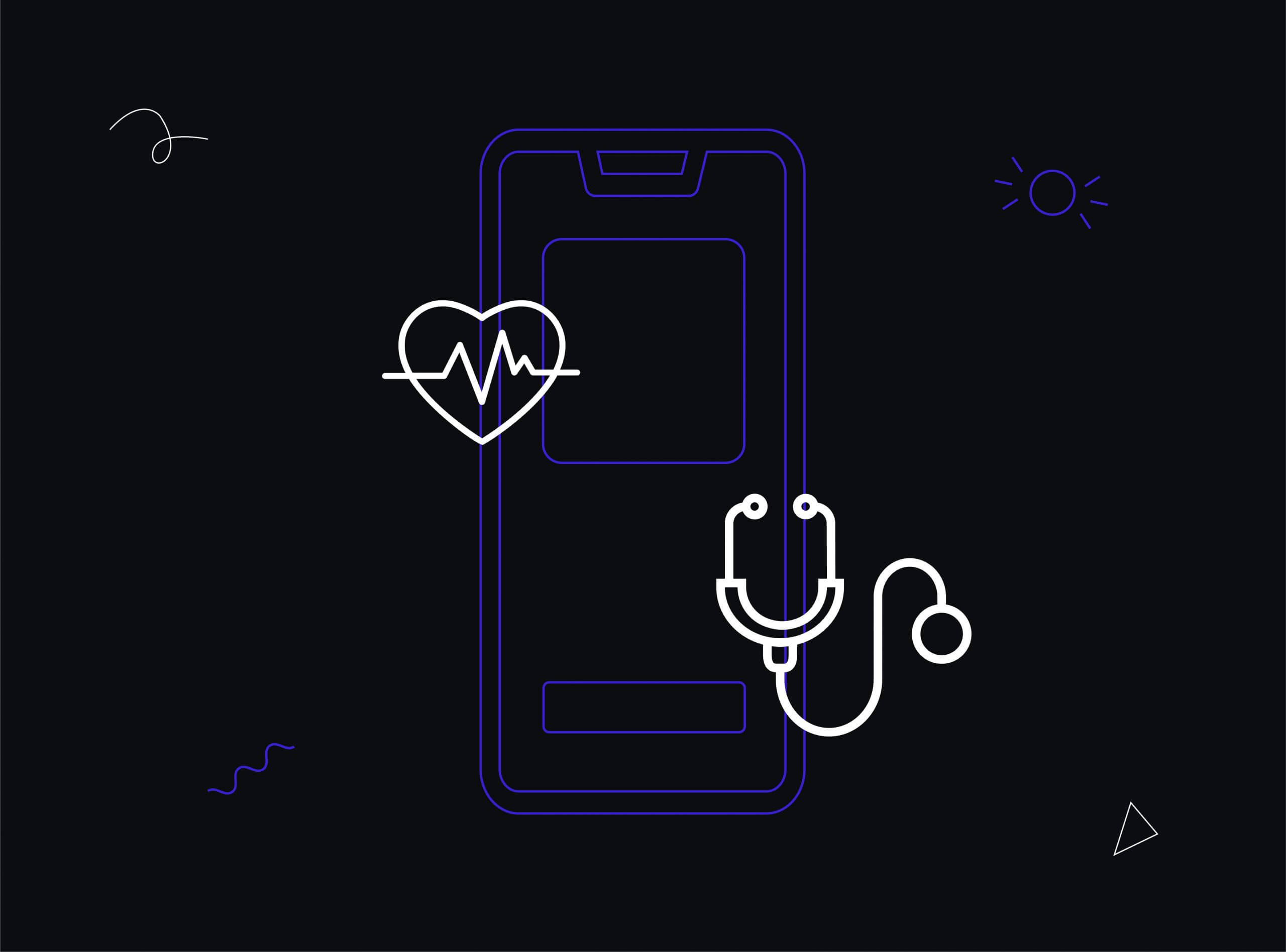
7 Practical Tips for Designing Healthcare Apps
Designing a healthcare app is no ordinary task; it requires a fine balance of usability, trust, security, and empathy. With users ranging from patients to doctors and caregivers, healthcare app UI design must prioritize clarity, simplicity, and functionality. Here are eight essential tips to ensure your app delivers a seamless and reliable experience.
1. A Purpose-Driven Easy to Use Interface
Your users are seeking efficiency, not complexity. The healthcare app UI design should prioritize intuitive navigation, essential features, and quick access to critical actions.
Key Insights:
- Streamlined Design: Avoid clutter by focusing only on features users need most, like appointment booking, medication reminders, or accessing medical records.
- Usability Testing: Test the app thoroughly to ensure every action, from filling out forms to scheduling appointments, is effortless and frustration-free.
- Contextual Help: Include tooltips or guided walkthroughs for users unfamiliar with digital platforms.

2. Secure and Accessible Medical Records
Medical records are at the core of healthcare. Your app must ensure these are easily accessible to authorized users while safeguarding privacy and adhering to regulatory compliance (like HIPAA or GDPR).
Key Design Considerations:
- Layered Access Control: Implement features like two-factor authentication for added security.
- Streamlined Access: Allow patients and doctors to retrieve records with minimal steps, yet ensure privacy is maintained.
- User-Friendly Dashboard: Present medical records in an intuitive format with clear categorization for easy browsing.
3. Thoughtful Use of Colors
Colors in healthcare app UI design do more than make the app visually appealing; they evoke trust and set the emotional tone.
Best Practices:
- Cool Colors: Use blues and greens for a calming, trustworthy feel, ideal for general healthcare.
- Mental Health Focus: Incorporate softer tones like pastel yellows or purples to convey warmth and optimism.
- Visual Hierarchy: Use contrasting colors to highlight urgent notifications (e.g., red for warnings or emergency actions).

4. Mitigating the Fear of Misinterpretation
Healthcare apps handle critical information, leaving no room for ambiguity or confusion. Misinterpretation of icons, labels, or instructions can lead to mistrust or even harm.
Best Practices:
- Clear Icons and Labels: Test visual elements with real users to ensure they convey the right meaning.
- Contextual Hints: Use pop-ups or brief descriptions to guide users through complex processes.
- Real-World Metaphors: Represent actions with familiar symbols, like a pill bottle for prescriptions or a calendar for appointments.
5. Quality Control and Compliance
Trust is the foundation of any healthcare app. Your healthcare app UI design must ensure the app functions accurately and complies with local laws and industry standards.
Key Actions:
- Error-Free Features: Regularly test features like heartbeat measurement or medication tracking to ensure they are reliable.
- Licensed Professionals: Only verified medical professionals should be allowed to register on the app.
- Regulatory Compliance: Design with HIPAA, GDPR, or equivalent regulations in mind to ensure data security and legal adherence.
6. Personalization for User-Centric Care
Healthcare is personal, and your app should reflect that by offering tailored experiences for users.
Best Practices:
- Personalized Dashboards: Allow users to customize their dashboards to focus on what matters most, like upcoming appointments or medication schedules.
- Notifications and Alerts: Send reminders for medication or doctor visits based on user preferences.
- Adaptive Features: Design interfaces that cater to specific groups, such as larger text for elderly users or voice-assisted navigation for visually impaired users.
7. Accessibility for All Users
Healthcare apps are used by a diverse audience, including older adults and those with disabilities. An accessible design ensures inclusivity and usability for everyone.
Key Accessibility Features:
- Adjustable Text Sizes: Provide options to enlarge fonts for better readability.
- Screen Reader Compatibility: Design with ARIA (Accessible Rich Internet Applications) standards to ensure visually impaired users can navigate effortlessly.
- Voice Commands: Incorporate voice-activated actions for hands-free operation.
Designing a healthcare app is more than just aesthetics; it’s about ensuring functionality, security, and empathy. By incorporating these eight tips and prioritizing healthcare app UI design, you can create a platform that not only meets user needs but also fosters trust and engagement.
A well-designed healthcare app doesn’t just enhance user experience—it can truly revolutionize how care is delivered.
How We Bring HealthTech to Life
At ProCreator, our mission is to design transformative user experiences across industries, including healthcare. Here’s how we’ve leveraged our expertise to create innovative and user-focused solutions for our clients.
1. GSK
GSK, a global leader in healthcare, needed a platform to make its services accessible and efficient for users.
Our Solution:
- Designed a user experience design website that prioritized clarity and ease of navigation.
- Integrated UX design tools to provide a seamless experience for patients and healthcare providers alike.
- Ensured the platform complied with global accessibility standards to reach diverse user groups.
Impact:
Improved user engagement, reduced time-to-action on the platform, and enhanced customer satisfaction across demographics.

2. Being
Mental wellness requires privacy and empathy. Being approached us to create an app that ensures users feel safe while accessing mental health resources.
Our Solution:
- Developed an intuitive interface that balances aesthetics with functionality.
- Built robust privacy features to protect sensitive user data, addressing one of the most critical aspects of user experience design in healthcare.
- Crafted interactive prototypes for iterative testing, ensuring a polished and user-friendly final product.
Impact:
The app saw increased user retention rates, establishing trust among users through secure and empathetic design.

3. Fitpage
Fitpage wanted to provide users with a personalized fitness journey through a user-centric app.
Our Solution:
- Focused on user personas to deliver an interface tailored to individual fitness goals.
- Incorporated user experience fundamentals like scannable patterns and clear navigation.
- Used data-driven insights to design features like customizable fitness plans and progress tracking.
Impact:
Fitpage saw improved user engagement and a significant boost in app downloads, becoming a leading name in fitness solutions.

The Role of UI Design in Healthcare
Healthcare is our catalyst for a healthier tomorrow and well-designed digital platforms can help us achieve that faster. A calming tone, intentional UI design, and accessible content are not just extras—they are essential elements for gaining user trust.
In the comments, let us know your thoughts or tips for healthcare app UI design. At ProCreator, we specialize in crafting exceptional user experiences that drive engagement and trust.
Visit us to discover why we’re the top UI UX design company in Mumbai – where HealthTech, Edtech, Fintech, and AdTech solutions come alive.


