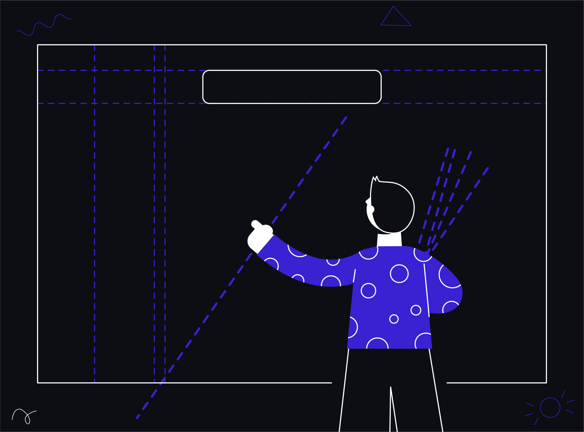
Designers always emphasize implementing strategic layouts for their designs. Having layout grids to design helps the elements in the interface appear connected and related. To create an organized and consistent design all we need to do is apply a grid system.
What is a layout grid?
A layout can be defined as an invisible internal structure that governs where and how the elements are to be placed within the interface. It ensures that no matter how many screens you’re designing, all of them have the same internal structure and they appear consistent. So, how can you use layouts in your designs to make them look polished? Before we understand how to use layouts, we need to understand the things that make up a layout.

A layout is a structure formed by grids. Grids are rows and columns spanned across the entire canvas of the screen, which divides it into many equal parts. These parts are called modules. What flows through the space between these individual modules is called a gutter. One of the primary uses of the layout is to make sure your design stays responsive across different screen sizes, densities, and platforms. High-density screens have more pixels per inch than low-density. As a result, UI elements of the same pixel dimensions appear larger on low-density screens, and smaller on high-density screens. While deciding our layout, we need to understand this factor and design our grid system to responsibly accommodate the elements of the screen irrespective of the screen density and size.
Types of layout grids
In the layout grid system, there are four different types of grid layouts.

Manuscript Grid
It’s the simplest and single-column grid which comprises a rectangular area. The area can be filled with content like images and blocks of text. It consists of large margins and blocks. Manuscript Grids are best suited for Informational websites, where there is a continuous flow of text in the form of content.

Multicolumn Grid
This form of grid system deals with placing the content (illustrations and text) into separate columns. The size and number of columns are dependent upon the layout you want to provide. The number can vary from two to six. The value of the gutter should be consistent across the grid. It gets easier to figure out which column to use to place the text and what columns should be allocated for the images or illustrations. Newspapers are a good example.

Modular Grid
The modular grid has both the rows and the columns. Together they create a matrix structure of cells with an appropriate gutter. It is mostly used to handle complex layouts of a website or an app. The way our apps are placed on our phones is the work of using a modular grid.

Custom Grid
You can use different-sized modules if you need to establish a visual hierarchy based on their importance in a similar context. Also, ensure to keep the gutter length optimum in your layouts.
An essential element of any layout is the vertical end margins. The width of these vertical margins varies according to the screen size. Make sure to only expand this width up to appropriate sizes. Make sure to properly place your elements of the grid with enough vertical margins too.
Importance of layouts in design
- Layout plays a significant role in graphic design. Proper layout enhances the look of the particular object and the objects as a whole piece of design to create a stable composition.
- The success of a graphic design depends upon the way a user perceives the content placed on an interface. If it is readable and attracts the right parts, a proper layout can help you achieve that.
You may have realized by now the structure, various types, and usage of layouts in design. All the layouts explained above can be used on websites based on the choice and the nature of the site.
Craft cohesive designs with strategic layouts! Designers, unlock the power of layout grids to connect and organize interface elements. ProCreator, your go-to digital design agency, can elevate your design game with tailored layout solutions. Let’s bring consistency and polish to your designs – connect with us for design excellence!


