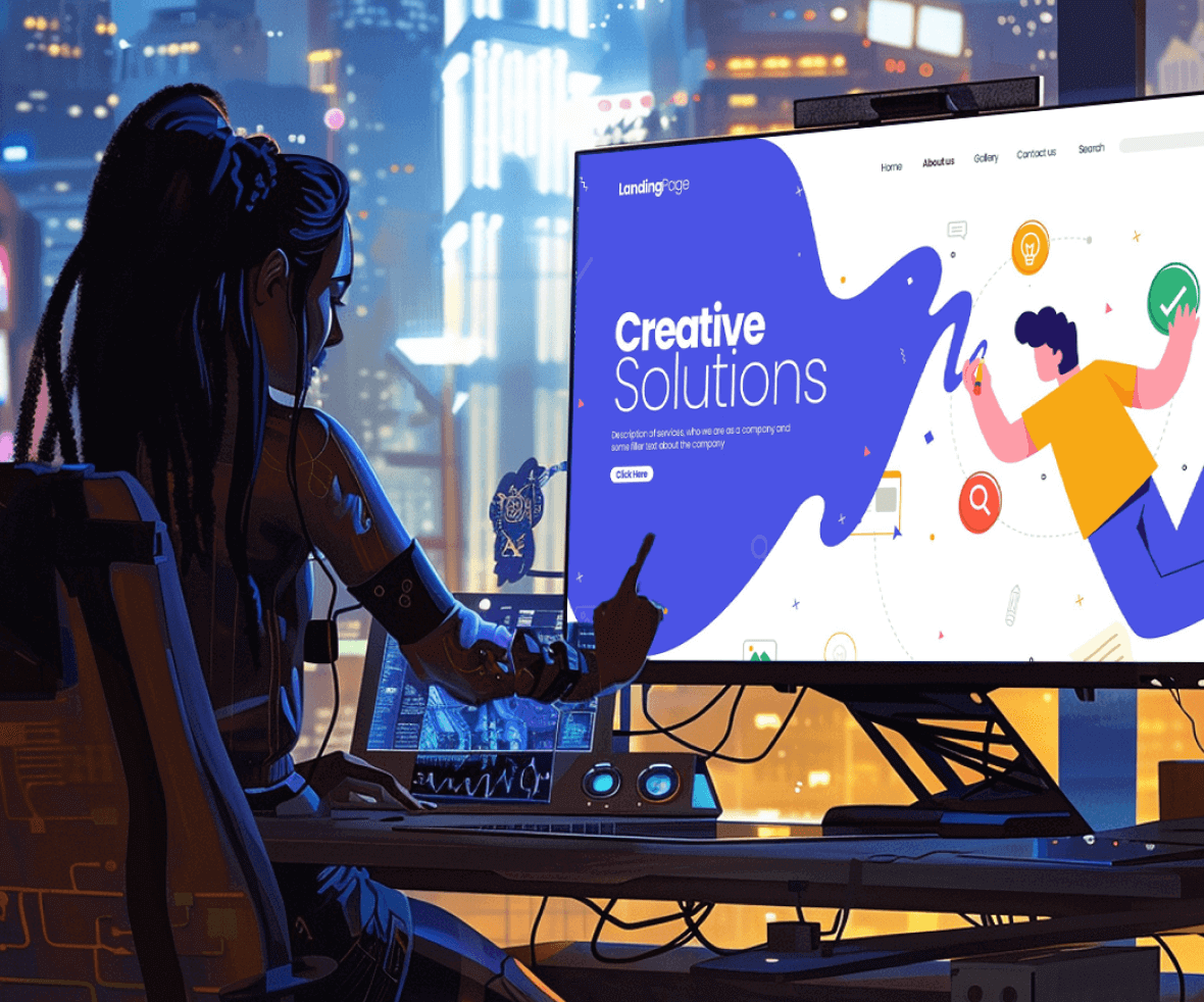
Long complex lines of text or an image that can replace that text still conveying the same message, which one would you prefer? Humans are visual creatures. We process visuals much faster than text, and they tend to stick in our minds for longer.
That’s why illustrations in UI design play a crucial role in communicating messages effectively and leaving a lasting impression. So, it’s no surprise that illustrations in UI design are becoming increasingly popular. But illustrations aren’t just about decoration; they can be powerful tools for enhancing the user experience.
Let’s explore some key places where illustrations can make a big impact on your interfaces:
1. Homepage Illustrations
The homepage illustrations in UI Design are the ones that help in developing a personal connection with the user. They help in communicating the brand language and identity. They act as a visual language and help the user to communicate with your product.

2. Mascot
A mascot is like a visual assistant for your application or your website. It personifies your brand and a face to it. They perform the task of keeping the users engaged and attached to the product.
MailChimp is a great example. Before the rebranding, they used to have Freddie as their Mascot, guiding the user through the entire website. In the physical clown, the clown Ronald plays that role for McDonald’s.

3. Landing Screens
Using illustrations on the landing screens, with clear information about what the product is about, makes the onboarding easier for the user. It turns out to be interactive and helpful at the same time. Consider a manual with engaging illustrations that would be easier to understand and use, rather than ten log pages of texts.

4. Building Emotional Connection
Humans are emotional creatures. The right illustration can evoke feelings of joy, trust, or even inspiration. This emotional connection can create a more positive user experience and build lasting brand loyalty.

Remember, illustrations are powerful tools, but like any tool, they need to be used wisely. Consider these additional tips:
- Align with your brand identity: Choose illustrations that reflect your brand’s voice and personality.
- Maintain visual consistency: Use a consistent illustration style throughout your UI to create a sense of cohesion.
- Prioritize clarity over complexity: Keep your illustrations simple and easy to understand, especially on smaller screens.
By strategically incorporating illustrations in UI design, you can transform your UI from merely functional to truly captivating. So unleash your creativity, embrace the power of visuals, and watch your user engagement soar!
What is the wait for? Get your creative heads to work and we are happy to receive suggestions on best use cases for utilizing illustrations in UI design.
Craft captivating user experiences with illustrations – the heart of visual communication! Elevate your UI/UX with the best digital design agency. Unleash creativity, tell your brand story, and make a lasting impact with the right digital design partner – ProCreator, your trusted UI UX design agency in Mumbai!


