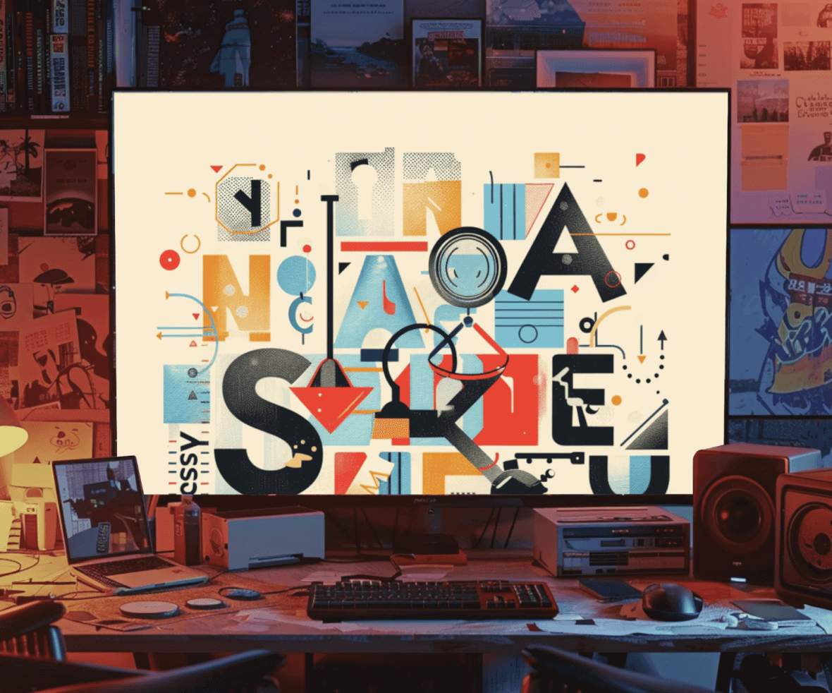
Among the varieties of typefaces available, it is essential to divide them into categories. It helps the designer gain a basic understanding of the different typeface classifications, where they come from, and how they differ. The typefaces are divided into the below categories. Let’s learn about the various typeface classifications.
Essential Typeface Classifications in Typography
1. Serifs
As the name suggests, the typefaces that have serifs, the small curves attached to the primary stroke of the character are grouped under the serifs typeface. Serifs were among the first created digital typefaces. They are often used in print media for body and headlines both. Serifs are further classified into the following.

2. Old Style Serifs
They were developed in the late 15th and 16th centuries. They put more emphasis on the diagonal axis. The minimum contrast exists between the thick and thin strokes. The serifs are angle-headed and bracketed (curve attaching the stem and the serif). Adobe Garamond, and ITC Berkeley are some of the examples.

3. Transitional Serifs
As per the name, transitional serifs evolved in the 18th century while the transition was happening from the old style to modern. They put more emphasis on the vertical axis. The serifs are vertical as well. The contrast is more between the thick and thin strokes. Baskerville, Bulmer, Perpetua are some of the examples.

4. Slab Serifs
They are thick, rectangular serifs with almost no contrast between the thick and thin strokes. It is an equal-width serif. Rockwell and American Typewriter are some of the examples.

5. Modern Serifs
They were developed in the late 18th century. They have straight serifs with an emphasis on the vertical axis. A high contrast exists between thick and thin strokes. They have almost no or very little bracketing. Didot, Bodoni, and Fenice are some of the examples.

6. Glyphic Serifs
The glyphic-style serifs appear more carved and engraved (lapidary) than the pen-drawn ones. The serifs are more triangular and flaring towards outside. Quorum, New text, Albertus are some of the examples.

7. Sans Serifs
Sans means without, the terminology sans serifs suggests the typefaces without serifs. They are more modern than serifs in terms of look and development as well. They have evolved in recent times, with the development of the digital design industry, and are thus considered modern. Just like serifs, sans serifs are also classified into the following.

8. Grotesque Sans
It is the earliest and the first famous sans serif. The curves are square for this sans serif, with a spurred capital G and double story lowercase g. There is not much contrast between the strokes. Bureau Grot and Franklin Gothic are some of the examples.

9. Neo-Grotesque Sans
They are a more rational form of the grotesque. They have an everyday outlook with very little contrast. Helvetica, Arial are some of the examples.

10. Humanist Sans
They are of the calligraphic roots and have higher stroke contrast than any other sans serif. They have open strokes. Verdana, and Cronos are some of the examples.
11. Geometric Sans
They are constructed out of geometric forms like the shape of ‘a’ and ‘o’ appear to be precisely round. They do not have a contrast among the strokes. Futura, Avenir are some of the examples.

12. Scripts
The script typeface is based upon writing made of flexible brush, fluid strokes of handwriting, and the strokes provided with an image of calligraphic handwriting. They are used for decorative writing like cover letters or wedding invitations. They are categorized under the following. You can learn more about the Script Typeface here- Script Typeface & Types Of Script Typeface

13. Formal Scripts
The letterforms in a formal script are connected and provide a combination of rhythmic strokes. There are a large number of fonts available for formal scripts- Greyhound Script, Balmoral, Fling, etc.

14. Calligraphic
It resonates with the actual handwriting. They resemble being drawn by a flat-tipped brush or calligraphic pen. They have high contrast among the strokes. Mistral, Ballerino are some of the examples.

15. Decorative
In simple terms, it comprises all the typefaces that do not fall into the above categories. These are developed by keeping a specific use case in mind. There is no specific set of rules that they follow but are created and customized for particular interfaces. Cuba and Morris Troy are some examples.

The world of typography can seem vast, but understanding typeface classifications is a powerful first step. By grouping typefaces into categories like serifs, sans serifs, and scripts, designers gain a foundation for selecting the perfect font for any project.
This quick guide has explored the most common classifications, from the elegant curves of old-style serifs to the clean lines of geometric sans serifs. With this knowledge in your toolbox, you’re well on your way to making informed decisions about the typography that shapes your designs.
Ready to take your design typography to the next level? Partner with a UI UX design agency that can guide you through the typeface jungle! At ProCreator, we believe in the power of well-chosen fonts to elevate user experiences. Let’s collaborate to create visually stunning and impactful designs together.


