Icons are used as the means to communicate important information, via a symbol or an image. Like illustrations or typography, icons should also match the style and tone of the brand. There are a few characteristics of an icon that collectively form a part of well-designed icons.

Clarity
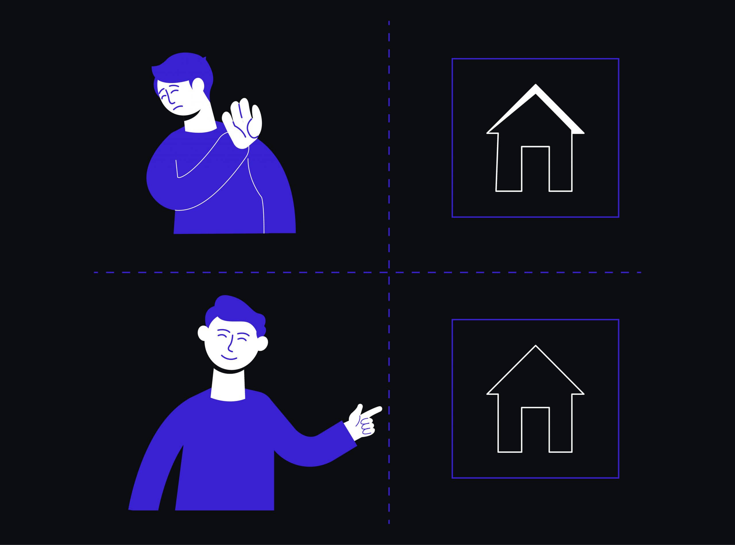
Icons should be understandable to the user in a single glance. They should be designed & drawn clearly and relative to the context or object you are trying to represent. The clarity in icons enhances the memorability of the design as the user can recognize from the prior references. For example, the icon of an airplane for putting the phone to a flight mode is easily understandable by the user.

Consistency
The style, the color schemes you chose to design icons should be consistent throughout the interface. It should resonate with the other elements of the interface. The consistency helps in better understandability of the interface, as the user can relate with the previous interactions, he had with the interface. Last, but not least, choose a consistent style across the interface.

Scalability
The icons you design should be scalable for smaller to larger screens. Designers face this issue while designing for larger screens. If not appropriately scaled, when the user views the same website on a smaller screen, the icons appear pixelated as well as distorted. It ends up providing a bad experience to the user.

Color Schemes
Color schemes you chose for your icons are essential as well. The color palette you choose or the style guide you decide for your icons defines a lot about the brand and the visual appearance of the icons. Every color you choose should have a meaning attached to it. Correctly chosen colors can set the look and style aside and helps in delivering the correct message.
If the correct combination of color and style, both that are resonating with your brand are chosen, the icons become more useful both for the brand and the user. Following the common characteristics of an icon helps maintain consistency and the user will be able to relate better, which in turn increases the usability of the entire product or the website.