
Did you know that Singaporeans spent an average of 4.51 hours per day on mobile apps?
That time isn’t just spent scrolling feeds – mobile usage has also become increasingly business-critical, with more B2B platforms shifting to mobile-first models across industries like logistics, finance, & field services.
Yet despite this shift, many B2B mobile apps fall short. They suffer from bloated user interfaces, confusing navigation, & low adoption rates – largely due to poor mobile app interface design.
In this blog, we’ll break down how B2B apps in Singapore can improve their user interface design with the right strategies, supported by local examples and actionable insights. Whether you’re building a new solution or reworking an existing one, these best practices will help you design interfaces that drive real business outcomes.
Let’s dive in!
Why B2B Mobile App Interface Design Is Different from B2C?
Most UI designers still borrow mobile app UI design ideas from B2C playbooks – assuming what works for casual consumers will translate into B2B success. In fact, poor mobile app layout design is a major reason why B2B applications often fail to scale or retain adoption after onboarding.
The difference lies in context.
B2C users explore apps for convenience or entertainment. B2B users, on the other hand, operate under pressure. They use mobile applications to complete critical workflows — while on the move, in noisy environments, or against tight deadlines.
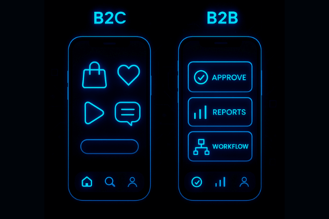
Most importantly, B2B users are:
- Task-focused and time-constrained
- Often working in noisy or different environments (e.g., field, factory, warehouse)
- Dependent on accuracy, speed, & interoperability
Yet, many B2B mobile apps suffer from:
- Overloaded dashboards: Many apps display all available metrics, tasks, and alerts in a single dashboard view. This creates visual clutter, making it difficult for users to focus or take action quickly.
- Vague button labels and poor affordances: Common UI design elements like buttons and icons often lack clarity. Labels such as “Submit” or “Process” don’t explain outcomes, while unlabeled icons lead to confusion. In high-stakes environments, these ambiguities slow down users or lead to critical errors.
- Lack of visual hierarchy or prioritization: Without a clear visual hierarchy, users can’t distinguish between primary actions and background information. This causes delays, mistakes, and missed deadlines, particularly for mobile users who rely on quick access in high-pressure scenarios.
The core problem? These apps are built to showcase the full range of product capabilities, but they neglect how users actually work.
Rather than guiding users through streamlined task flows, they emphasize feature visibility — often at the expense of clarity, focus, and speed. This leads to friction, abandonment, & reduced ROI across teams.

Mobile App Interface Design – 9 Strategies that work in 2026
These strategies are backed by real-world mobile app UI design ideas and our expertise that have proven to reduce friction, boost adoption, and improve decision-making in B2B contexts.
1. Design for Decision Velocity
B2B users are focused on outcomes, not exploration.
A well-designed mobile app should help users make high-impact decisions quickly. This means structuring data access, CTAs, & information hierarchy to guide users toward the next best action.
The goal is to help users act quickly and confidently without digging through layers.

Best Practice:
Map out key decision points (like approving an order) and design backward from there.
Use real-time data feeds and highlight what needs immediate attention using visual cues like color tags or urgency indicators.
For Example: DBS IDEAL Mobile highlights key account alerts & payment approvals on the dashboard – allowing finance teams to act instantly on high-priority tasks like releasing funds or approving payrolls.
2. Prioritize Role-Based Customization with personalized dashboards
Generic dashboards dilute productivity.
In 2026, mobile interfaces must dynamically adapt based on user preferences, roles, and permissions. A warehouse operator shouldn’t see the same dashboard as a regional manager.

Best Practice:
Build modular UI components that can be toggled on/off based on roles. Use role detection and user behavioral analytics to adjust layouts, features, and data views, ensuring users only see what’s personalized for them.
In fact, many fintech firms in Singapore prioritize personalized dashboards.
For Example: UOB Infinity (Business app) adapts the dashboard based on user role — treasurers see cash flow insights, while SME owners get loan & invoice tools front and center.
3. Build for Low-Connectivity Scenarios
Remote and field users often operate in environments with unstable connectivity. A robust B2B mobile app should offer core functionality offline and sync intelligently when back online.

Best Practice:
Prioritize critical workflows for offline mode. Implement auto-sync indicators and conflict resolution UIs.
For example: NETS Biz (SME payment app) caches transaction history and allows payment verification offline in hawker centres, syncing once connectivity is restored.
4. Simplify navigation for faster access
Users shouldn’t have to hunt through nested menus to complete frequent tasks.
In enterprise environments where time is critical, complex navigation structures slow down workflows and increase error rates in mobile UI design.
Flat navigation instead minimizes depth and maximizes discoverability – enabling quicker execution of common actions. It is a proven mobile app layout design principle proven to reduce task time.

Best Practice:
Limit navigation depth to 2–3 levels. Use fixed bottom navigation bars for consistency and surface context-sensitive options directly where they’re needed most.
Grab Driver App is one of the popular mobile app UI examples, which uses a flat structure with clear bottom navigation tabs (e.g., Home, Earnings, Account), reducing menu depth and enabling fast task switching while on the road.
5. Use Micro-interactions to Reinforce Trust
In B2B apps, where users rely on precision and speed, even small interface responses can significantly impact confidence and usability.
Micro-interactions, such as loading indicators, button state changes, swipe confirmations, or success messages, offer instant visual or tactile feedback.
They are critical in app design UI as they assure users that the system is responding, reducing uncertainty in fast-paced, high-stakes B2B environments.
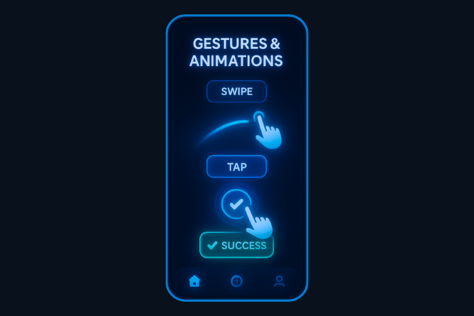
Best Practice:
Prioritize microinteractions that align with key user actions — like submitting a form, syncing data, or completing a workflow. Keep them fast, intuitive, and purposeful to support task confidence without adding cognitive noise.
For example: OCBC Velocity App shows real-time status indicators (e.g., “Submitted,” “In Progress”) after transaction actions – reassuring corporate users that actions have been logged or approved.
6. Streamline Workflows End-to-End
B2B mobile apps often inherit complex workflows from legacy desktop systems — creating friction for mobile-first users.
Instead of forcing users through multi-step forms or rigid sequences, the app design UI should simplify task flows to support speed and accuracy. A modern mobile UI must reduce friction and streamline tasks from start to finish.

Best Practice:
Start by conducting task analysis — observe how users actually complete their day-to-day tasks on mobile to identify friction points & bottlenecks.
Restructure those workflows to reduce taps, remove redundancy, and improve flow using inline actions, auto save, & progress indicators.
For Example: At ProCreator, we redesigned Zebpay’s crypto workflows to guide first-time users through investing, borrowing, & SIPs using simplified task flows and empty states. The result? A faster path to completing actions for a seamless fintech user experience.
7. Make Data Work Harder
Mobile screens are small.
Every data point displayed should support a user decision or action. Avoid dashboards packed with metrics; instead, highlight performance indicators relevant to the role.

Best Practice:
Create data tiers — critical, secondary, and archival. Only display critical data by default; make the rest discoverable.
For Example: DBS SME Toolbox surfaces KPIs like invoice aging, receivables, and cash flow trends in an easy-to-scan dashboard—helping business owners get insight at a glance.
8. Use Contextual UI to Reduce Cognitive Load
Contextual design means showing relevant options based on user actions, time, or location.
In B2B apps, where users are often performing complex tasks under time pressure, this approach reduces cognitive load & decision fatigue.
Instead of overwhelming them with every option or feature upfront – you show only what’s useful at that moment, making the user experience smoother and faster!

Best Practice:
Use contextual tooltips to reduce friction.
Implement condition-based rendering to display UI elements only when they are relevant. For example, a “Submit Report” button appears only after all required fields are filled.
For example: EZ-Link Wallet app hides top-up, transaction history, and QR scan features until the user taps into specific tabs, preventing overwhelm on the primary screen.
9. Integrate Enterprise-Grade Security That Feels Invisible
B2B apps deal with sensitive company data, user credentials, & compliance-heavy workflows. In 2026, the best apps should integrate authentication, encryption, and data protection without disrupting flow or making security feel like a barrier.

Best Practice:
Keep security strong but simple.
Use methods like Face ID or one-tap logins so users feel safe without getting interrupted. Avoid unnecessary password prompts — let users stay focused while the app quietly protects their data.
UOB Infinity is another popular mobile app UI example that integrates biometric authentication, transaction approval via Face ID, and session timeouts — keeping security strong but invisible to users unless triggered.
ProCreator Case Study – How we transformed Zebpay’s mobile app interface design
At ProCreator, our goal was to rethink Zebpay’s mobile app interface design to better serve a diverse user base – from crypto newcomers to seasoned investors.
As ZebPay is a leading crypto exchange platform, the challenge wasn’t just aesthetic. It was about building trust, simplifying decision-making, & supporting high-stakes financial actions through intuitive design.
We restructured 24 core workflows to eliminate friction and guide users through actions like buying, lending, & setting up SIPs. Instead of overloading screens with metrics, we used mobile-first interface principles to streamline the experience, highlighting only the data that drives action.
The redesigned interface introduced.
- A streamlined dashboard showing real-time portfolio performance and crypto value comparisons.
- Seamless task flows for crypto SIPs, lending, and buying with visual confirmations
- Contextual empty states with actionable elements & prompts to guide users in a straightforward path to easily adopt the app’s key features.
- Tailored recommendations based on a user’s experience level (via onboarding quiz)
- A cross-platform experience, making it easy for users to switch between the mobile app & web while tracking portfolio health

At ProCreator, we ensured that ZebPay’s mobile app interface design prioritizes clarity, personalization, & actionability.
Rooted in user-centric design principles – this Fintech UI UX redesign helped ZebPay increase user engagement, reduce onboarding friction, and stand out in a highly competitive crypto market.
The Fastest Way to Improve App ROI? Rethink the User Interface.
In B2B mobile applications – every delay, misclick, or abandoned task adds up to result in lost revenue, slower workflows, and user churn.
Yet most mobile apps still treat mobile app user interface design as an afterthought – layering it over dense workflows instead of reimagining how users actually move through tasks or prioritizing it early in application development.
Here’s the reality: If your app doesn’t guide users to act fast and confidently, it’s not just underperforming – it’s draining ROI.
Mobile app interface design is where real value is won or lost. It’s what turns clunky tools into seamless workflows. What makes users trust, adopt, and keep coming back?
At ProCreator, we’re a UI UX design agency that helps forward-thinking SaaS, fintech, & enterprise brands transform their mobile app design into a competitive edge.
From product audits to full-scale redesigns – our approach blends business strategy with data-driven design precision, turning complex workflows into intuitive, high-performing interfaces.
If your b2b mobile app is underperforming, book a mobile UI UX audit with ProCreator and let’s redesign for results.
FAQs
How to develop a successful B2B mobile app in 2025?
Start your B2B mobile app design with user needs, not features. Use role-based dashboards, offline access, & task-driven UI design – with the goal to improve speed, adoption, and ROI. A UI UX design audit can reveal key design gaps early.
What are the best practices for B2B mobile app design?
Simplify navigation, reduce clutter, support fast actions, and personalize by role. Use contextual UI design, micro-interactions, and secure flows that don’t interrupt the user. Focus on B2B mobile app design that reduces friction and drives business results.
Can interface redesign drive measurable business results?
Yes, it can. By reducing support tickets, speeding decision-making, and increasing user retention – a focused interface redesign often delivers immediate ROI improvements.
What’s the fastest way to check if a mobile interface needs a redesign?
Start with a UI UX design audit: benchmark task completion times, key button visibility, and error rates. Poor metrics often indicate interface design gaps.


