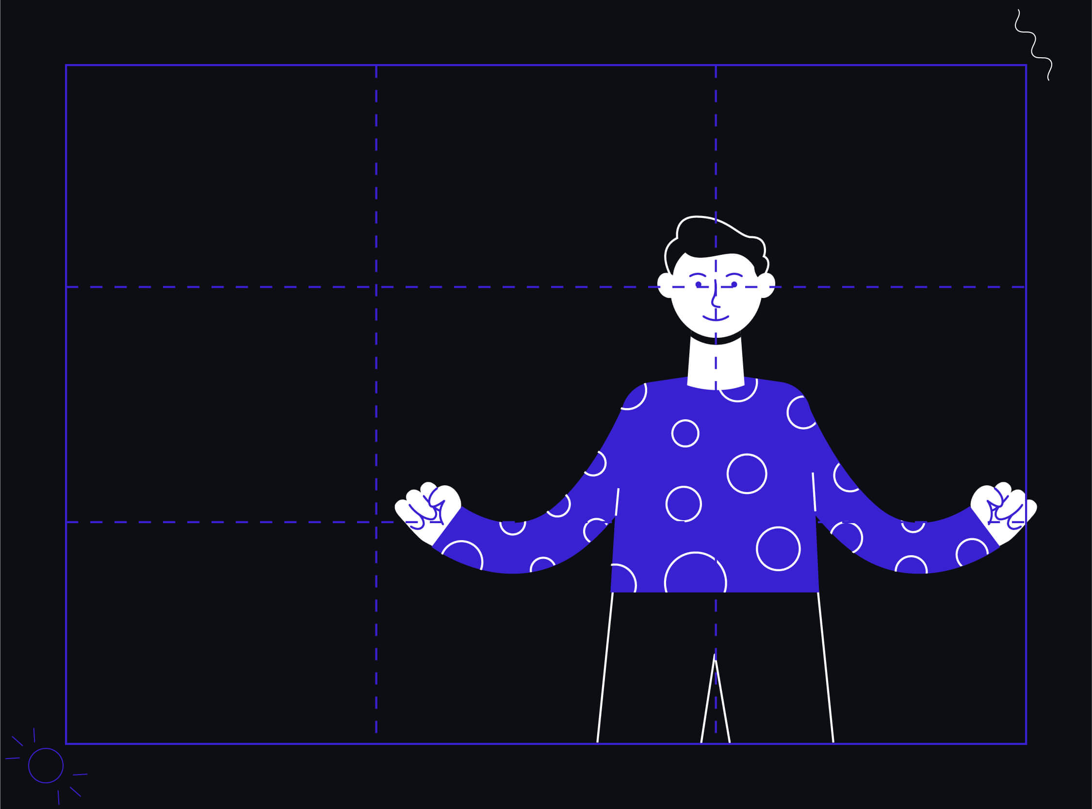
The rule of thirds is the most common rule used in a photographic composition. It is a useful rule to create balanced and interesting shots. When it comes to capturing the subject and the focused object, it is essential to learn about the composition of a picture. This is where the Rule of Thirds plays its part.
Rule of Thirds Definition
The rule of thirds is used by laying a grid of a 3X3 composition, which eventually divides the image into 9 equal parts. This provides a structure to the image, and laying down various objects becomes easy. There are 4 lines in total which give rise to 4 intersection points. All the quadrants and intersection points have their importance. Studies say that the human eyes have most of their focus on the interaction points, not on the central focus of the shot taken. Let’s understand their significance.
Basic Rules of Thirds Grid

- All essential elements are placed on the intersection points of the grids. They are also termed as focal points.

- Our eye then looks at a picture, and scans it from left to right.

- The object to be focused upon should be placed on the top-left intersection point.

- The next intersection that holds the most weight is the lower-left intersection point. So the second most crucial element should be placed there.

- Placing the grid over a picture helps designers to position the call to action in a perfect manner.

- The rule of thirds introduces symmetry into your design by providing delightful visual results.

- The rest of the objects are placed in rectangles according to the weight they hold following the streak from top to bottom.
A Landscape view

While clicking a landscape picture, the best way is to align the horizon with the horizontal lines. Keeping objects to focus, like in this one the sun on of the focal points.
A portrait image

The portrait above is aligned across the vertical lines, and the objects of importance like the eyes are placed on the intersection points.
The rule of thirds helps in creating better layouts for your entire interface design. It brings symmetry and proportion to the design. It helps you in clicking better pictures, which conveys the correct message to the user.
Master the art of composition with the Rule of Thirds! Elevate your visuals and design with precision. Ready to transform your UI/UX? Connect with the best digital design agency for expert guidance


