
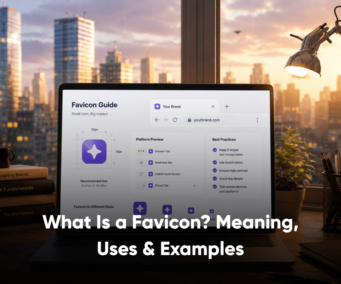

A favicon is a small detail, but it often becomes one of the first visual cues users notice on a website. It appears in browser tabs, bookmarks, search results, and saved shortcuts, helping people identify a website faster.
That matters because users rarely browse one page at a time. They compare, switch tabs, save links, and return later. A clear favicon makes that return path easier and keeps the brand visible in crowded browsing moments.
In this guide, we’ll cover what a favicon is, how it differs from a logo, where it appears, and how to create one that works across browsers and devices.
What Are Favicons?
A favicon is the small website icon that appears beside a website name in a browser tab, address bar, bookmark list, or browser history. The term comes from “favorite icon,” because browsers first used it to help users recognize saved websites.

People often confuse a favicon with a logo, but they serve different roles. A logo represents the full brand across websites, apps, documents, and marketing assets. A favicon is a smaller brand cue designed to stay clear at very small sizes.
Most favicons are square icons shown at 16×16 px or 32×32 px in browser tabs. Larger favicon sizes may be needed for mobile shortcuts, app-like web experiences, and search result displays.
Why Are Favicons Important?
A favicon helps users recognize your website faster. This is useful when someone has multiple tabs open, saves your website as a bookmark, or returns to your site after comparing other options.
For a business website, that small icon supports brand recall. It gives users a quick visual signal that they are on the right website, especially when the page title is cut short in a crowded browser tab.
A website favicon also adds a more finished feel to the site experience. When a site does not have a favicon, browsers may show a default blank icon. That can make the website look incomplete, especially for users comparing brands, agencies, SaaS products, or service providers.
Favicons also appear in Google Search results when the site meets Google’s favicon guidelines. This makes the icon part of the search experience, not just the browser experience.
Favicon vs Logo: What Is the Difference?
A favicon and a logo are connected, but they are not the same thing. A logo is the larger brand mark used across websites, pitch decks, social profiles, sales assets, product interfaces, and marketing campaigns.
A favicon is a reduced version of that identity. It needs to work at a much smaller size, usually inside browser tabs, bookmarks, mobile shortcuts, and search results.
| Element | Logo | Favicon |
|---|---|---|
| Purpose | Represents the full brand identity. | Helps users recognize a website quickly. |
| Size | Usually appears in larger spaces. | Appears in very small spaces. |
| Detail | Can include text, symbols, and brand elements. | Should use a simple icon, letter, or symbol. |
| Where it appears | Website header, app screens, documents, and marketing assets. | Browser tabs, bookmarks, search results, and mobile shortcuts. |

A good favicon may come from the logo, but it should not be a forced miniature version of the full logo. If the logo has too many details, the favicon should use a cleaner symbol, initial, or simplified brand mark.
Where Do Favicons Appear?
Favicons appear across more places than most website teams expect. That is why the design needs to work across different screen sizes, browser surfaces, and device contexts.
You can usually see a favicon in these places:
- Browser tabs: The favicon appears beside the page title and helps users identify the tab faster.
- Address bar: Some browsers display the favicon near the website name or URL.
- Bookmarks: A favicon helps users find a saved website without reading every page title.
- Browser history: The icon can support quick recognition when users revisit a past page.
- Google Search results: Google can show a site favicon beside organic search results when the favicon follows its guidelines.
- Mobile shortcuts: When users save a website to a home screen, the favicon or app icon becomes part of that shortcut experience.
This is why a favicon should be treated as part of the website’s visual identity. It supports the way people scan, compare, save, and return to digital experiences.
Various Favicon Examples
Strong favicons usually have one thing in common: they stay recognizable even when they appear at a very small size. The best favicon examples use simple shapes, clear initials, strong contrast, or a reduced version of the brand’s main identity.

Google uses its multicolor “G” as a favicon. The icon works because it keeps the brand’s core colors while using a simple letterform that stays clear inside a browser tab.
Facebook uses its recognizable “f” icon as a favicon. This works because the letter is already strongly connected with the brand, and the simple color contrast makes it easy to spot quickly.
Amazon uses a simplified icon that connects back to its brand identity. The favicon does not need to show the full logo. It only needs to give users a fast visual cue that they are on the right website.
These examples show why a favicon should not be treated as a resized logo. A good favicon works as a compact brand signal that remains readable across browser tabs, bookmarks, search results, and mobile shortcuts.
What Is the Best Favicon Size and Format?
According to Google Search Central, a favicon for Search results should be square, at least 8×8 px, and preferably larger than 48×48 px so it looks good across different surfaces.
The right favicon size depends on where the icon appears. Browser tabs may show a favicon at 16×16 px or 32×32 px, but search results, mobile shortcuts, and app-like web experiences may need larger sizes.
Google says a favicon for Search results must be square, at least 8×8 px, and preferably larger than 48×48 px so it looks good across different surfaces. Googlebot-Image must also be able to crawl the favicon file, and Googlebot must be able to crawl the home page.
| Use case | Recommended size or format | Why it matters |
|---|---|---|
| Browser tab | 16×16 px or 32×32 px | Keeps the favicon clear in small tab spaces. |
| Google Search results | Square icon, preferably larger than 48×48 px | Helps the favicon appear clearly across search surfaces. |
| Apple touch icon | 180×180 px | Supports saved website shortcuts on iOS devices. |
| PWA or app-like shortcut | 192×192 px and 512×512 px | Supports installable web app and home screen icon experiences. |
| File format | ICO, PNG, or SVG | Supports browser compatibility and modern website setups. |

ICO remains common for compatibility. PNG works well for clean raster icons. SVG can work for modern websites, but browser and platform support should be checked before relying on it alone.
How to Make a Favicon?
Creating a favicon is not about shrinking your logo into a tiny square. It is about designing a small, clear brand cue that stays recognizable across browser tabs, bookmarks, search results, and mobile shortcuts.
The same characteristics of an icon apply here: it should be simple, recognizable, scalable, and clear without extra explanation. A favicon has even less space to work with, so every shape, color, and detail needs to support quick recognition.
1. Start with a Simple Brand Element
Choose one visual element from your brand identity. This could be an initial, symbol, monogram, or simplified part of your logo. Avoid using the full logo if it becomes unclear at a small size.
2. Keep the Shape Clean
Favicons usually work best in a square or circular format. Use a simple shape that can hold its form at 16×16 px and 32×32 px. Thin lines, detailed illustrations, and long text usually disappear at that size.
3. Use Strong Contrast
Your favicon should be visible on light and dark browser themes. Choose a color combination that keeps the icon readable without depending on fine details. If your brand color is too light, test a darker background or outline.
4. Design in a Larger Canvas First
Create the favicon in a larger square canvas, such as 512×512 px, before exporting smaller versions. This gives you cleaner edges and makes it easier to prepare different sizes for browsers and devices.
5. Export the Right File Formats
Save your favicon in formats such as ICO, PNG, or SVG. ICO is still widely used for browser compatibility, while PNG and SVG can work well for modern websites when implemented correctly.
6. Add the Favicon to Your Website
Upload the favicon file to your website and connect it inside the HTML head section. A basic favicon code example looks like this:
<link rel=”icon” href=”favicon.ico” type=”image/x-icon”>
MDN explains that the rel attribute defines the relationship between the current document and the linked resource. For favicons, rel="icon" tells the browser which icon represents the page or site.
7. Test It Across Browsers and Devices
Check how the favicon appears in Chrome, Safari, Firefox, Edge, bookmarks, mobile shortcuts, and search results. A favicon that looks sharp in one place may appear blurred or cropped in another.
Favicons for Mobile, PWAs, and App-Like Websites
Favicons now support more than desktop browsing. For SaaS platforms, fintech products, ecommerce stores, and service websites, users may save the website to a phone home screen or interact with it like an app.
This is where mobile icons and PWA icons matter. A progressive web app may need larger icons, such as 192×192 px and 512×512 px, so the website can appear cleanly when saved or installed on a device.
For Android devices, maskable icons help the icon adapt to different device shapes. web.dev recommends keeping important icon details inside the safe area so the icon does not get cropped when the system applies different shapes.
This does not mean every website needs a full app icon system. But if your website acts like a product, portal, SaaS dashboard, or customer platform, your favicon and app icons should be planned as part of the larger UI UX design services workflow.
Does a Favicon Help SEO?
A favicon is not a direct ranking shortcut. You should not expect rankings to improve only because you added or changed a favicon.
But a favicon can support search appearance and click confidence. Google can show a favicon beside organic search results, which helps users identify the website before they click.
That matters when users compare multiple search results quickly. A clear, brand-representative favicon can make the result feel more recognizable, especially for users who have seen the brand before.
Google also recommends keeping the favicon URL stable and making sure the favicon is visually representative of the website’s brand. If Googlebot-Image cannot crawl the favicon file, the favicon may not appear in Search results.
Common Favicon Mistakes to Avoid
A favicon looks simple, but small icon design and technical mistakes can make it ineffective. These are the common issues to check before publishing.
- Using the full logo: Full logos often become unreadable when reduced to favicon size.
- Adding too much detail: Thin lines, gradients, and complex illustrations can disappear in browser tabs.
- Ignoring contrast: Low-contrast favicons may blend into light or dark browser themes.
- Using the wrong shape: A favicon should usually be square so it displays properly across search and browser surfaces.
- Changing the favicon URL often: Google recommends using a stable favicon URL for Search visibility.
- Blocking crawlers: Googlebot and Googlebot-Image need access to the home page and favicon file for Search result display.
- Skipping mobile checks: A favicon may look fine on desktop but weak as a saved mobile shortcut.
A good favicon is simple, stable, and easy to recognize. It should feel connected to the brand without trying to carry the full brand system alone.
Favicon Checklist Before Publishing
Use this checklist before adding a favicon to your website or updating an existing one.

- Check recognizability: The favicon should still look clear at small sizes.
- Check shape: Use a square canvas so the favicon works across browser and search surfaces.
- Check contrast: Test the icon on light and dark backgrounds.
- Check formats: Prepare ICO, PNG, or SVG versions based on your website setup.
- Check HTML implementation: Add the correct
<link rel="icon">tag in the head section. - Check mobile icons: Add Apple touch icons or PWA icons if your website needs mobile shortcut support.
- Check crawl access: Make sure crawlers can access the favicon file and home page.
- Check brand fit: The favicon should connect back to your visual identity and not look like a random icon.
Conclusion
A favicon is a small design element with a practical job. It helps users recognize your website across browser tabs, bookmarks, search results, and saved shortcuts.
The best favicons are simple, clear, and connected to the brand. They do not try to carry the full logo. They act as a compact visual cue that helps users return to the right website faster.
For growing brands, small interface details like favicons, icons, navigation, visual hierarchy, and product screens all shape trust. If your website or product experience needs a sharper digital identity, ProCreator’s UI UX design services can help improve the customer-facing experience with business-aware design thinking.
FAQs
Is a favicon the same as a logo?
No. A logo represents the full brand identity, while a favicon is a smaller website icon designed for very small spaces.
What size should a favicon be?
Common favicon sizes include 16×16 px and 32×32 px for browser tabs. For Google Search results, Google recommends a square favicon larger than 48×48 px when possible.
Which file format is best for a favicon?
ICO, PNG, and SVG are common favicon formats. ICO is widely used for compatibility, while PNG and SVG can work well for modern websites.
How do I add a favicon to my website?
To add a favicon to your website:
Create a favicon image.
Save it as
.ico,.png, or.svg.Upload it to your website’s root directory.
Add the following code inside the
<head>section of your HTML: <link rel=”icon” href=”favicon.ico” type=”image/x-icon”>


